Tap any tip to open toggle ⚡ some gifs may take a moment to load
Featured ideas 🦄 are rare ideas you may not have seen before ;-)
💡 Ideas and tips
Header banners
🎧 Crutchfield adds a Category-level, quiz-like product finder above results as an alternative to filter and sort

👱🏾♀️Amika knows their product thumbnails don’t tell the story — customers can find their best match to their hair type and style goals through their simple quiz

👗 Oxford embeds a gift finder flow inside the hero banner (see optimization suggestions below)

Love the concept but a few implementation tips if you try this:
1) Keep the widget dimensions consistent through the flow to minimize layout shift
2) On mobile, make sure the widget keeps the product grid (somewhat) visible above the fold to avoid confusion (Where am I? Can I just jump to products?)
3) Apply event tags to track abandonment at each step (especially the email CTA) to optimize your flow over time
4) Build vs buy when you can* This 3p app UI shows results inconsistent with the brand's Collection layout and card design
If you have a larger catalog and your quiz will return more than 4-5 results. A native product finder can be built on top of Search like Algolia, Constructor, Doofinder or Bloomreach.
Of course this takes extra dev effort (esp. if you want personalized results to pass to an Account or through Klaviyo / etc) -- you can try an app first as an MVP to gauge whether shoppers use it or not, then "build" if it has legs
Bonus tip: When writing quiz flows, use analytics to find the most commonly applied filters for a given Category -- unnecessary questions/options will increase friction and abandonment
👗 Zoe Kratzman guides you through top-level filters with hero banner tiles for Fit and Wash attributes in its denim collection
Mobile view:
According to Baymard Institute “35% of ecom sites don’t provide direct access to products featured in inspirational imagery,” meaning customers won't find a banner’s hero products pinned to the top of the product list post-click. Consider providing instant access to featured products with a Shop the Look slider. (Make sure shoppers can choose size and color variants where applicable)
🦅 Amercian Eagle Outfitters is the first merchant to launch such a feature (these GIFs are heavy and may take a few to load, jump to static screens below for the gist)

Mobile view:

Static shots:


🥘 Le Creuset embeds 2 FAQ links in its Dutch Ovens category banner for quick access

👗 Aritzia features conveyer belt and rotating model style animated sub-category tiles on specific pages. Note the pause button for accessibility

Desktop view:
👕 Classic Tees shouts out its top value propositions for easy scanning and prime visibility

🎧 Crutchfield features their “headphone guy” in a whimsical photo that also highlights their helpful customer service value proposition (although the low contrast white text is a bit hard to read)

👟 KURU promotes a 5-star review to its category banner

Zoom:

🧦 Bombas knows sleeve length is an important attribute when shopping for t-shirts, so it gets marquee treatment in the Men’s T-Shirt banner

🛍️ Macy’s invites you to talk to a Style Expert above filter chips

🌙 Baboon to the Moon uses scrolling text to highlight category-level selling propositions (with icons!)

Mobile view:

👔 Hugo Boss promotes a bold CTA in its category headers to find your fit (and filter results by your size when you’re done the quiz)

Subcategory tiles
Examples of full-page subcategory tiles (Intermediate Category Pages)


Example of single row subcategory tiles (Hybrid layout)


🥾 Carhartt features attribute tabs above its product grid for select categories, for example Style-Fit-Benefit for Pants and Shorts, Style-Toe-Benefits for Shoes and Warmth-Weather-Collection for Outerwear:


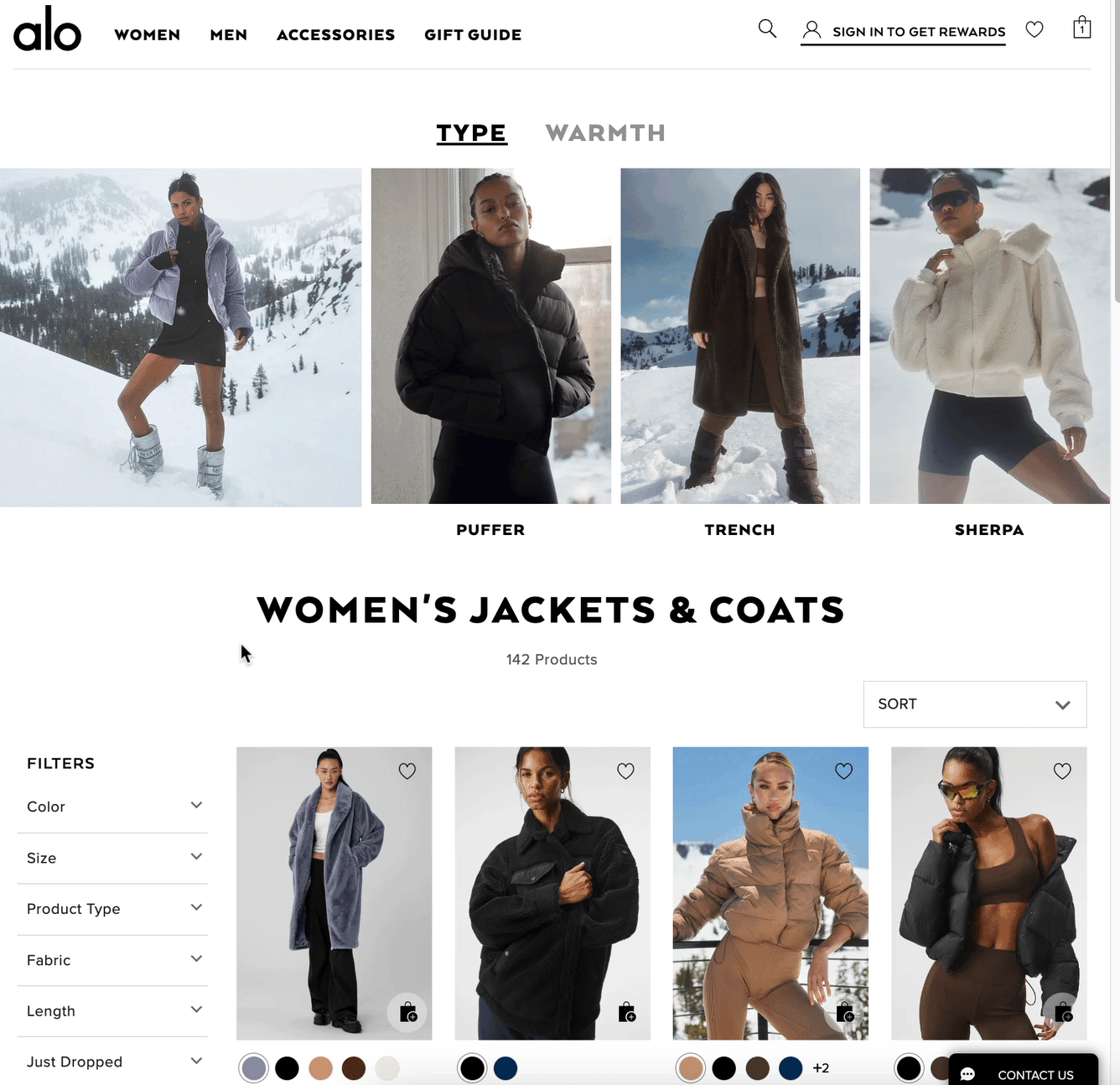
❄️ Alo knows both style and warmth-factor drives purchase decisions for its Jackets & Coats category
🍀 Clove turns its category tiles into a marquee with scrolling animation. This is especially helpful on mobile where many tiles are hidden from the initial viewport. However, animations can have a web performance impact, so make sure to test and keep performance best practices in mind.

Desktop view:
👗 OAS displays next-category suggestions when you hit the end of a product list, and animates them for extra jazz. Because the video tiles can be lazy loaded, this has less impact on web performance than if placed at the top of the product list

Desktop view:
👀 Jordan Craig flies category tiles into view on its home page, this can also be applied to category pages

Desktop view:
Grid style
🍱 This design trend of organizing banner and tile slots in an assymetric and aesthetic way is heating up. Check out Louis Vuitton’s holiday gift guide in bento style
And Balmain’s “bento lite” style
In-grid banners
🧘🏼 Featured subcategory

🧘🏾 Refer-a-friend

💄 Product quiz

☕ Promote loyalty program

🎁 Gift finder quiz

🎅🏼 Holiday shipping cutoff info

📣 PR Quotes
Branch and Amberjack use in-grid banners to rotate PR quotes from famous outlets


🌟 Feature collections
🧘🏾 Alo advertises its Atelier division within its loungewear categories

🤗 Orient newbies
🧘🏻 Alo links to a “New Here?” special landing page

🤑 Highlight a sale
🔫 Bulletproof Coffee animates its sale banner

🎅🏼 Promote pickup options
👖 Duluth Trading slots an animated banner promoting curbside pickup option with the 12/23 order cutoff for Christmas pickup (geolocated to your time zone!)

🥾 Patagonia makes its value props stand out with a rotating banner inside the product list grid — the use of “negative” space makes it pop even more

👗 Daniela Draper slips a Gift Voucher CTA in its desktop and mobile filter menus. The animation draws additional eyeballs ;)

👙 Hanky Panky and Uncommon Goods both use a grid tile as a “feeling lucky” button that pulls a random product for inspiration. You may use this strategically to pull from a specific set of strong sellers Hanky Panky:

Uncommon goods:
🎁 MeUndies understands many of it’s BFCM visitors are brand fans shopping for themselves. Cross-selling “Gifts for Him” within Women’s categories could bump AOV while helping shoppers tackle their gift list faster
🧘🏾 Alo asks new visitors to click into its brand tour landing page experience (check out the video below to see the landing page)

Landing page:
🫣 Cautions
These in-grid graphics are placed mid-page, but they may be confused with the end of the page — avoid them on mobile and desktop, and make sure at least one product flanks your in-grid banner within a given row


Back to Category page ideas
👉 Follow on LinkedIn for daily ideas 💡