Ecom Ideas
  • Homepages & nav
  • Category pages
  • Product pages
  • Cart pages
  • Checkout
  • Site search
  • Internationalization
  • Holiday ideas
  • Featured idea gallery
  • Topical articles
Subscribe

Get daily ideas

LinkedIn
💡
Ecom Ideas
/Checkout
Checkout
/
✈️
Shipping step
✈️

Shipping step

Tap any tip to open toggle ⚡ some gifs may take a moment to load

Featured ideas 🦄 are rare ideas you may not have seen before ;-)

🛍️
Note that these examples refer to non-Shopify sites that have more flexibility over their checkout UI, except for those highlighted in orange. A dedicated Shopify section is coming soon!

💡 Ideas and tips

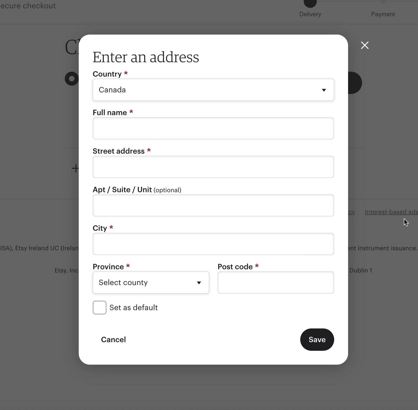
Shipping address form

‣
Ask for Shipping before Billing
💡
Most ecommerce sites ask for shipping information first, with the occasional checkout requesting billing information first. Because it’s more conventional to ask for a ship to address first (along with contact information), this approach will be more intuitive to your cusotmer. It also makes more sense to let customers choose their preferred shipping option to update the running cost summary before asking for payment.
‣
Repeat express checkout options above Shipping address fields

👟 Famous Footwear offers express checkout options in the cart, but some users may click the Checkout button anyway and end up on this form. Repeating their quick pay options, graphically, above input fields gives them a second chance to save some effort

image
‣
Consider using microcopy to explain why personal contact info is required

🛍️ Nordstrom lets you know they’ll use your email and phone number for order updates and questions — this suggests to customers that personal info will not be used for marketing

image
‣
Consider country first for international checkouts to scope fields to relevant inputs
💡
Showing Country early in the shipping address form allows you to show more relevant forms to improve conversion and deliverability due to more accurate address inputs.

🧶 Etsy’s checkout reflows based on country selection

image
‣
Consider promoting popular countries to the top of the menu
💡
Promoting your most commonly selected countries to the top of your dropdown cuts the need to scroll through a long list, especially for the US, the UK and Zimbabwe! It’s fine to repeat it them in the list as well for those who will overlook it

🌍 North American countries are promoted to the top of the menu, visually separated from the alphabetical list, and repeated within the list.

image
‣
Have an Address 2 option, but collapse it
💡
User testing by Baymard Institute has found that the occasional user has trouble understanding what “Address 2” is for, and though a relatively infrequent issue, it’s a severe issue when it occurs. Not to mention - it’s annoying when users enter their street address into both fields and it passes to the shipping label. One way to mitigate this is to collapse Address 2 and make it optional/user initiated. This is preferrable to inline hint text, which may be already used for your field labels, or confuse users (per user testing from NN Group).

🐊 Crocs collapses its Address 2 field and uses color to make the accordion link POP

image

👗 Instead of collapsing Address 2, Aritzia uses clear hint text (as the field label) to explain what the field is for, and marks it optional. Consider A/B testing the 2 against each other

image
‣
Provide an easy (and optional) way to save info to an account

🛍️ Nordstrom includes a collapsed option to enter a password in the Contact info section. It’s unobtrusive, but easy to spot with the blue font

image

Select shipping method

‣
Use estimated arrival dates vs business days
💡
Don’t make customers math in their head — show estimated arrival date range or “Delivered by” dates (inclusive of processing lead time), and spell out the month vs using mm/dd format for maximum clarity.

Good examples after the jump 🙏🏽 but first, try to math these in your head:

image

Contrast the ⬆️ above with the below ⬇️ :

image
image
image
‣
🦄 Take an “arrival date first” approach

🚣🏿 J.Crew uses arrival date as the header and shipping method as the sub-text, referencing “today’s date” to give customers clarity on their options, and using days of the week for extra context

image
💡
Consider testing this against a price-first treatment to better understand what matters to customers — speed or cost? (Measure frequency of method selection under each condition versus general conversion rate)
‣
🦄 Indicate the time of day order cutoff to meet arrival estimates

👡 Steve Madden uses red text to add more visibility to the order cutoff — however, placing this text out of context with the shipping options below makes it easy to overlook. Consider inline placement like the examples below:

image

👠 Michael Kors shows cutoff times inline with shipping options

image

👗 Reformation places “order by” detail before arrival estimate to bring even more clarity to its copy — we read left-to-right!

image

👖 Alternately, you can simplify it with “If order placed today” and include a buffer for late-day orders. Levi’s simplifies its copy and removes the time-of-day cutoff. This can also reduce thinking and anxiety around “What time is it now? What is EST in PST terms?!”

image
‣
🦄 Use geolocation to personalize order cutoff to user’s time zone
💡
I found no live examples that I could prove are using geolocation — it just makes sense to me 🤷🏽  As a user on the Pacific Time Zone, I observed retailers frequently citing “Xpm” EST or CT in checkout.
‣
Consider/test a “cost first” approach

👚 Express highlights shipping cost in bold, with shipping method and arrival dates (with days of the week). Because shipping cost is a major influence on an ultimate purchase, this approach can help customers make faster decisions

image
‣
Consider showing both arrival dates and business day range

👚 Lulus shows both arrival dates and business day ranges, with prices clearly separated and easy to scan. This provides more clarity than simple “Expedited, Express and Overnight” labels, and supports users regardless if they care more about “how fast” vs “what day” their order arrives (or “how much”)

image
‣
Make it an Arrives by-Business day-Order by sandwich 🥪

🥪 Fashion Nova covers all the bases here — with a clear, vertically-aligned hierarchy, users can understand arrival date (with day of the week), speed in business days and order cutoff to hit these estimated dates, and a clear cost value

image

Other

‣
Highlight sustainable shipping

👟 Brooks Running suggests choosing Standard shipping to help reduce environmental impact

image
‣
Support adding a gift note

🎁 Anthropologie is just one example of a merchant enabling gift message entry from the Checkout step (although this is arguably better served from the Cart step). Ideally, you’ll offer it in both Cart and Checkout (as a fallback)

image

🎁 Another example from the North Face:

image
‣
Collect email and SMS opt-in with promo offer CTA

📿 Puravida uses an email opt-in checkbox with the email field and a “Get 20% off my next purchase” CTA with the shipping address form (to capture SMS opt-in)

image

🫣 Cautions

‣
Don’t hide shipping option selection behind a link or dropdown

🙈 Points for making the “Change shipping speed” link blue — but most checkouts provide radio buttons and clear shipping method selection in cart. Many mobile users will gloss over this option.

image

🙈 Agggghhh, placing the “Change” link in the top right of the section. No explanation needed

image

🙈 It’s so easy to overlook this dropdown that hides faster shipping options, especially with the big, bold, black Save & Continue button overshadowing it

image
‣
Don’t hide transit time information behind a tooltip

💣 There are so many ways to style text and microcopy to make it easy to scan at-a-glance. There’s no need to hide transit time behind tooltips!

image
‣
Don’t use long winded microcopy in your tooltip
💣
The first law of web copywriting is be concise. The second law of web copywriting is don’t use more words than is absolutely necessary for your given purpose, especially when using light text on dark background in a tooltip hover widget. The irony within my own caption length and copywriting here is not lost on me
image
‣
Don’t lead with “business day range” headings

👎🏽 Business day ranges are redundant, hard to scan and force users to math-in-their-head. Even “Standard, Express and Priority” would provide more context (as headers). This approach assumes shipping speed is more important to customers than shipping cost

image
‣
Fail to apply a visual hierarchy to shipping details

🙈 Text that spans more than one line, and contains multiple details should be visually broken up with line breaks and different text styling

image

See better implementations of shipping method vs shipping cutoff time below:

image
image
‣
Avoid placing important shipping details in a banner-style block

🙈 Banner blindness is real — especially when a drab color like dark gray is used. This merchant combines light-on-medium text with long microcopy many users will ignore

image
‣
You don’t need to include the year in estimated arrival date…

💣 This only clutters your microcopy and makes it harder to scan

image
‣
Don’t use too much horizontal white space between shipping method and cost

💣 Think of the journey users’ eyes must make to connect shipping cost to method

image
image

🤔 Compare the above to the lovely compact vertical alignment from Fashion Nova below:

image
‣
Avoid presenting shipping options in a 2-column grid

🙈 Presenting a 2x2 table with shipping options taxes the customer’s attention and brain. Vertical alignment is far more easy to process and choose from

image

💣 3 column grids are no better, but at least this example doesn’t stuff text into the boxes. But users have to click the boxes to see their related delivery estimates. Why make users work hard?

image
‣
Don’t fail to provide arrival date or transit time details at all

🙈 This merchant fails to clarify what Standard and 2nd Day means, considering that processing time applies — how much faster than Standard is 2nd Day? Is 2nd Day tomorrow or 2 days from now?

image

💣 How much faster is 1-2 Business Day shipping than Expedited and Standard? Is it worth the cost difference?

image
‣
Don’t use ghost fields 👻

🙈 The “thin line” field may look slick, but it’s just BEGGING for a user to Continue to shipping and trigger an error message

image

Back to Checkout ideas

👉 Follow on LinkedIn for daily ideas 💡