Tap any tip to open toggle ⚡ some gifs may take a moment to load
Featured ideas 🦄 are rare ideas you may not have seen before ;-)
💡 Ideas and tips
🧦 Bombas features category tiles above its traditional banners

⌚ MVMT adopts the mobile trend of featuring a category carousel above banner content. Consider making them horizontally scrollable

⚽ Dick’s Sporting Goods shows timely, trending searches in pill-button form for quick inspiration. If you get the search terms right, you can help users bypass both search and browse effort (consider personalizing them if you have first-party data to work from)

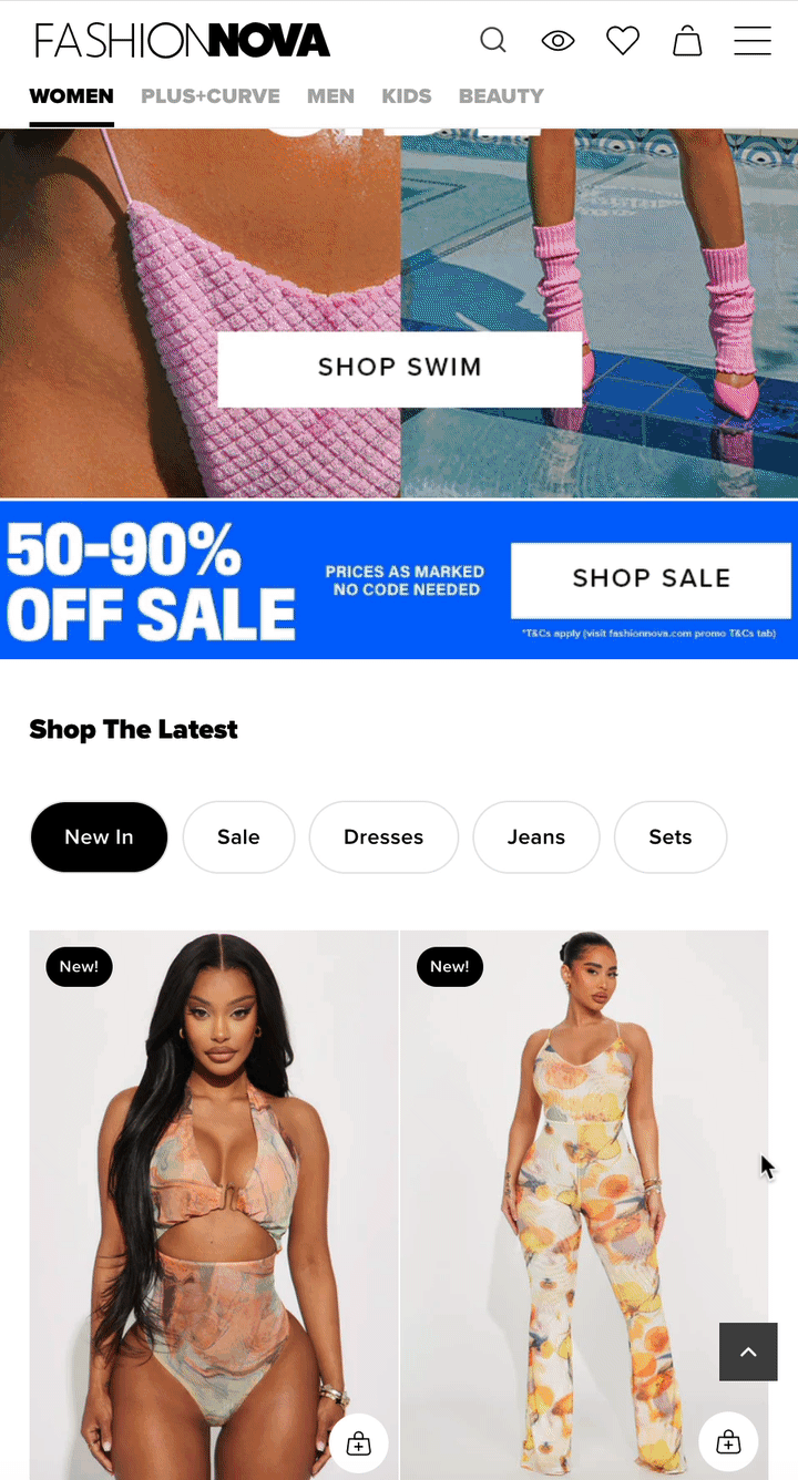
👙 Fashion Nova embeds product lists right into the home page, below its hero banner. The tabbed style makes it easy to explore multiple shopping scopes without leaving the home page (This GIF may take a bit to load)
🌈 Guess’ Shop by Color tabs are super-sweet

🥾 Kuru lets you browse by Style, Activity or Career attributes

🧸 Melissa and Doug allows you to view All “Most Gifted” products by default, and winnow down by age group if desired (top right)

📿 Puravida’s tabbed links are harder to spot than pill buttons

🧸 Melissa and Doug features a can’t-miss product finder on its home page

🩹 First Aid Beauty takes a tip from the popular fill-in-the-blank Mad Libs game to send customers to targeted (pre-filtered) products from a home page banner widget

Looks great on mobile too!

🎁 Cotopaxi bakes its Holiday Gift Finder flow directly into the home page template — no modals or page loads, just seamless guided selling
This kind of experience could also work nicely on product list pages as a hero block or mid-page section

Check out the flow demo below:
🦌 Moosejaw promotes its Sandals category with a 3-product animation (with some clever copy to boot 🥾)

👙 La Vie en Rose lets you preview bikini top and bottom combos from a home page merchandising block - while you can’t add your creation to cart from this widget, it does help you quickly play with the possibilities

🍭 Colourpop features restocks in a carousel. As a “fast beauty” brand, this serves its customers who often miss out on product drops. It also suggests urgency, what sold out before may sell out again…

👙 Monday Swimwear shows a “Trending in [City]” section on the home page, geolocated to visitor’s IP address

⌚ MVMT uses Yotpo’s Visual UGC feature to pull Instagram fan content into its home page

🧸 Melissa and Doug pulls posts that use their @MelissaAndDougToys tag into an Instagram carousel mid-homepage

💡 Uncommon Goods’ above-the-footer link map on desktop and mobile:


🛏️ Helix provides the best way to leapfrog category browsing and search with its personal mattress finder (left), and provides the second-best alternative, see what’s popular (right) — no rotating banners here! 🎠

💐 Proflowers uses the same strategy, but stacks them vertically rather than side-by-side. While they don’t use a carousel, this layout would allow for horizontal scrolling of actual products, vs a static banner

💡Ruggable lets users drag the marker left and right to see the difference between low and high pile heights

🍪 Feastables’ scrolling banners are on-brand and get a message across. (Before you tell me “scrollers are annoying!!” I’ve seen them win A/B tests! 🤓)
/w=1920,quality=90,fit=scale-down)
🦌 Moosejaw scrolls a series of Dad jokes mid-page — it’s certainly entertaining and on-brand

💡Ruggable highlights customer reviews with a “Read All Reviews” link

👟 Vessi embeds an FAQ accordion into its home page. As an indie brand selling direct to consumer, it allows Vessi to tell their brand story while adding relevant SEO keywords to their home page copy (waterproof shoes, vegan shoes, breathable shoes, etc)

⌚ MVMT pairs a PR praise carousel with its charitable value prop to boost its brand value. This simple scroller paired with famous logos is eye-catching below-the-fold content!

🪒 Every Man Jack features an easy-to-scan infographic that communicates the ethos of the brand - it’s clean 🧼

⛺ Rumpl uses home page real estate to tell its brand story and communicate its values

🐢 Tortuga shares its founder story teaser on the home page. The photo of the founders humanizes the brand and website experience

☕ Chamberlain Coffee embeds a configurable subscription widget into its home page - nice idea for #dtc #cpg brands

💄 If you collapse your banners to a slider/carousel view for mobile, animating the second tile can draw eyeballs to it to encourage swiping, like Haus Labs

👱🏿♀️ Cecred animates a mid-homepage infographic (this one appeared on the home page)

Mobile view:

🦙 Cotopaxi does something similar on certain PDPs, embedding GIFs within the infographic

Desktop view:

Alternatively (for better web performance) you could embed something like this as a looping .webm video file — but you may find mobile-to-desktop orientation challenging
❤️ Coach dresses up its featured bag with animated SMS-style customer love

🍳 Proclamation lets you tab through its PDP infographic to show the product in context for different size options

“Freeze models” (or live mannequins) were the rage in 1970’s department store windows, but occasionally you’ll still find them in shop windows and live events today. They certainly are trending on ecommerce sites — the digital version showing video product tiles where models change poses periodically (or frantically, as with GAP’s example below!)
👗 Artizia freeze model product tiles in a collection page

Aritzia models on mobile:
Bergdorf Goodman:
GAP wild models:
Telfar 360 rotating models:
👀 Jordan Craig flies category tiles into view on its home page, this can also be applied to category pages

Desktop view:
💡 Aavrani's home page hero banner summarizes brand ethos paired with "I'm looking for..." tabs (mobile screen in comments). This is effectively 'step 1' of a product finder quiz and a quicker way to see product than fiddling with hamburger/mega-menus

💰 If you’ve ever wondered if those “deal drawers” on Old Navy and GAP convert — they do (and that’s why they stick around). Here’s a collection of sites using the pattern, which can slide open automatically or remain a closed tab for user-initiated interaction

🐦 Allbirds annotates its featured collection cards with a short “why you should care” statement (scroll below to see video demo tabbing through cards)

Video:
Desktop-specific examples
💋 Kylie Cosmetics flanks its copy and call to action with graphics. Rather than slap text over a graphic background, this draws the eye inward and makes the message stand out

🍸 Skinny Mixes uses a white overlay to make its copy clear from the background image. (Bonus points for the emoji — you know we love our emojis at Ecom💡 Ideas!)

🦌 Common Deer’s value prop pops on a white block surrounded by a grid of shiny, happy people

👖 The Great Divide brings back the old skool Home page product grid, giving users a way to shop without searching or browsing the Category menu

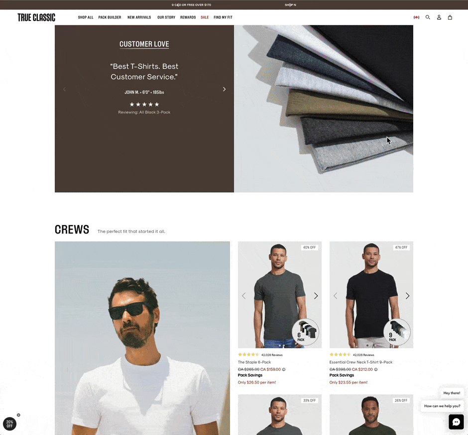
👕 True Classic embeds mini collections that replicate the Product List grid for featured categories on its home page (This is a larger GIF file - it may take a bit to load)
🪒 Every Man Jack shows off its street clout with a TikTok carousel. Click any Tik to open a fully shoppable video player 👇🏾 (they use VideoWise for this)
/w=1920,quality=90,fit=scale-down)
Zoomed in for effect ;-)

🦌 Moosejaw’s messy merchandising is unconventional — the pattern interrupt may draw more attention than a typical X-by-X product grid

🐢 Tortuga compares its travel backpacks against alternative products

🥑 Graza uses a table to compare its brand against alternative buying options (that shall remain nameless)

🛏️ Helix helps home page scrollers learn more about the product line with an embedded compare table

👁️ Esqido compares its value pricing against drug store and high end alternatives

🧦 Bombas lets you pre-filter by department from home page banners

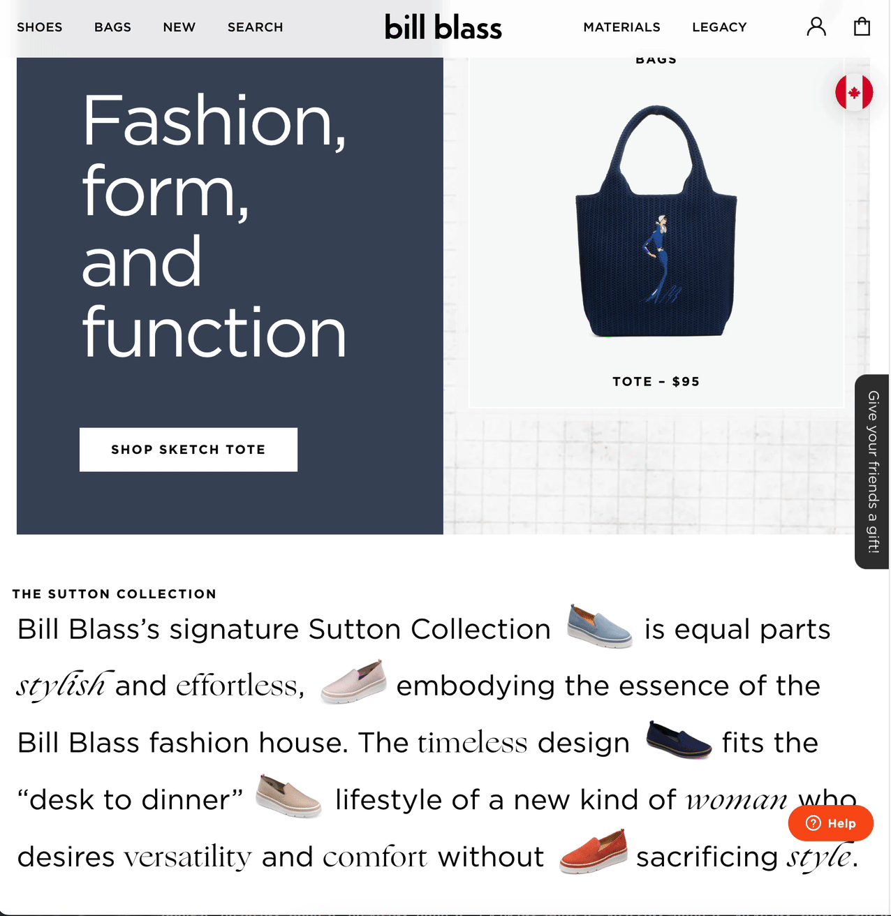
👜 Bill Blass embeds featured products within a story narrative

Back to Home page & nav ideas
👉 Follow on LinkedIn for daily ideas 💡