
No matter what month of the year it is, Black Friday is always just around the corner ;) #ifyouknowyouknow
It’s never too early to plan ahead, especially if your holiday strategy involves new feature development.
Get a turkey leg up on BFCM with these tactics swiped from top ecommerce sites in recent seasons:
🎁 Gift finding
1. Try a Tinder-style gift finder
There are many ways to build a product quiz or “gift finder” experience, but it’s tricky to get them “right” because so many variables are involved — how many steps? How many options per question? What options per question? What questions to ask??!!
I love Swatch’s simple gift finding flow. Why?
😁 Yes/No options reduces cognitive load (don’t make them think — hard) 😁 Graphics add context to the question (with sample product matches) 😁 It’s short and sweet 😁 The copy is succinct 😁 Very mobile-native vibe 😁 It doesn’t interrupt you with a request for your email ;)

There are many ways to build gift finders — if you want some inspo check out these live examples: 🦄 Uncommon Goods | 🧸 Build a Bear | 🍐 Harry & David (mid-page) | 🧸 Melissa & Doug | 👗 Aritzia | 👕 Kohl’s | 🚧 Lego
2. Try “mad libs” finders
In the Mad Libs game, you fill in blanks within phrases. This approach has worked well as an alternative to forms and now, ecommerce product finders.
Try them on the home page like First Aid Beauty (swap product types with “recipient + interest,” for example):

Or embed them below product list results, like Drmtlgy:

3. Test dropdown pre-filter menus in home page banners
For Holiday ‘23, American Eagle Outfitters added sub-category links to its home page banner buttons to help customers narrow their options on the landing page.

American Eagle uses these navigations year-round — but there’s plenty of time to test them before BFCM if you’re interested in stealing borrowing this idea.
Here’s another example AEO used post-holiday:

4. Try a Gift Finder CTA in the PDP Buy Box
If you’ve built a helpful gift finder, make sure to evangelize it everywhere. Visitors often enter via product pages instead of home / categories, so embedding a call-to-action in or near the Buy Box can help engagement — just be mindful of how placement impacts the Buy Button and other above-the-fold content.
Kay Jewelers baked a gift finder CTA into its Buy Boxes in 2023:

And brought it back for 2024 with a few design tweaks:
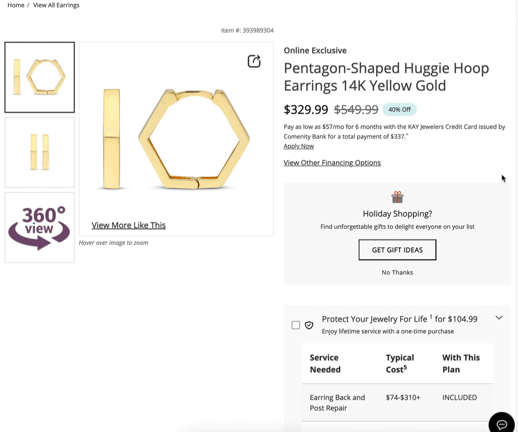
And yup, they will bring it back for 2025 (with an AI twist). If you’re skeptical if this tactic works, Craig Kistler who runs CRO for this website shares their results on LinkedIn:
We didn’t guess. We asked.
“Are you shopping for a gift?”
Half of those who clicked said yes and that small moment reshaped the entire PDP experience.
* AOV ↑ 5.3%
* Add-to-Cart ↑ 2.5%
* Revenue per Visitor ↑ 5.0%
What’s interesting is why it worked:
When visitors felt understood, they explored further.
Even those who said “No” stayed longer and viewed more products.
The takeaway → Personalization starts when you stop assuming.
Not every lift comes from prediction.
Sometimes it comes from asking the right question at the right time.
5. Promote gift finders with in-grid banners
Another touchpoint to promote your gift finder is within the product grid — if you have the bandwidth, you can embed product-specific finders within key categories.
Sephora embedded a “Need gift ideas?” banner into its product grid in ‘23:

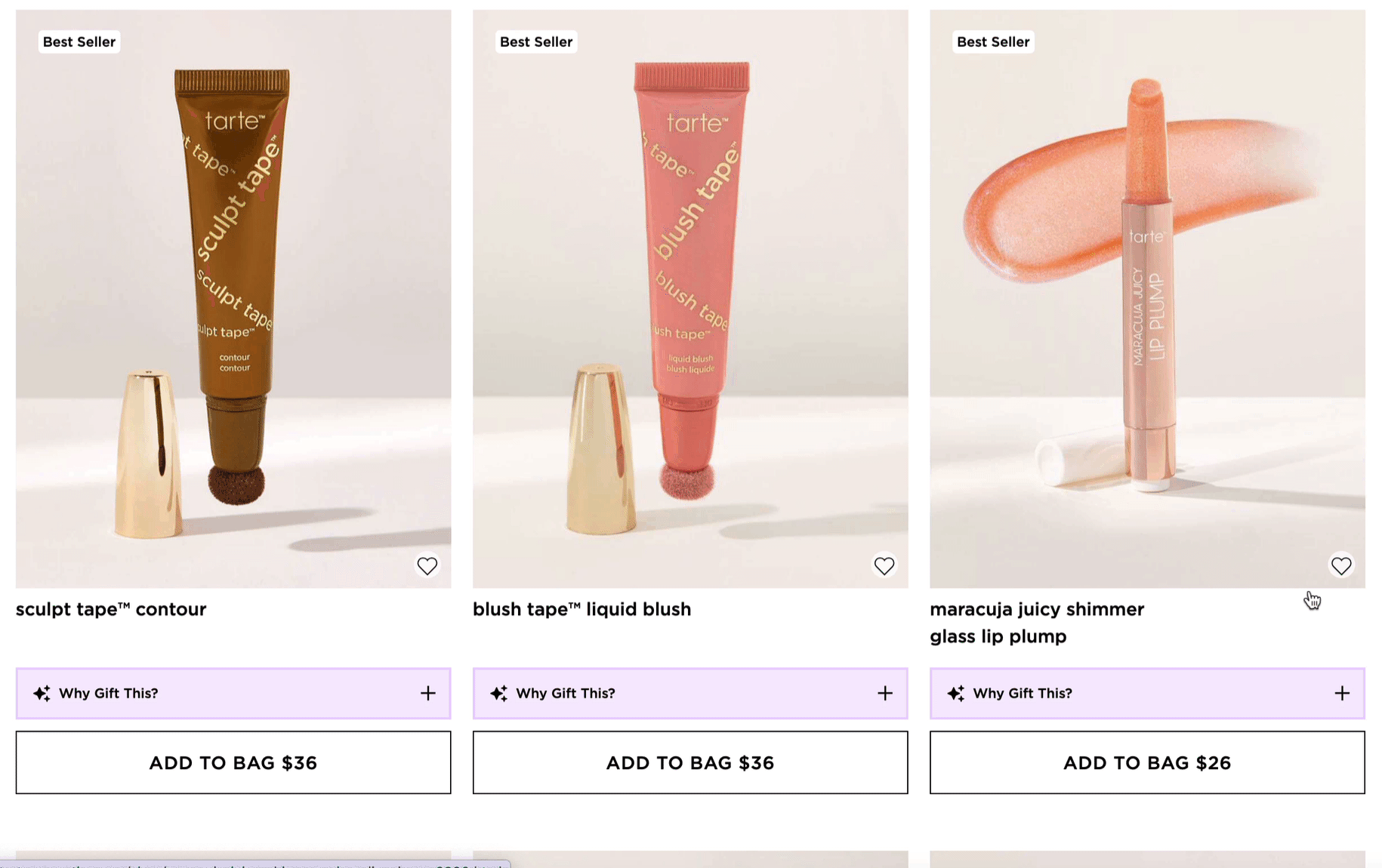
6. Try AI “Why Gift This” descriptions
Tarte found a novel way to integrate GenAI summaries into the PLP, giving gifters quick pre-click context when exploring their options
7. Give returning gift-visitors quick access to recently viewed items
This is a great year-round, but especially helpful for holiday gift season — the larger your catalog, the more helpful this quick-hit feature is to shoppers. There’s several ways to do it, here are a few of my faves ❤️ Burberry slides a drawer on arrival:

Dr. Martens uses a header menu notification - it’s a bit less intrusive, but also less obvious. It remains as a quick-access link as you navigate the site, helping shoppers keep the cart clean from navigation history — in other words, shoppers don’t need to rely on the cart as a bookmarking tool.
Cotopaxi uses a recommendations pod below product list results as you browse:

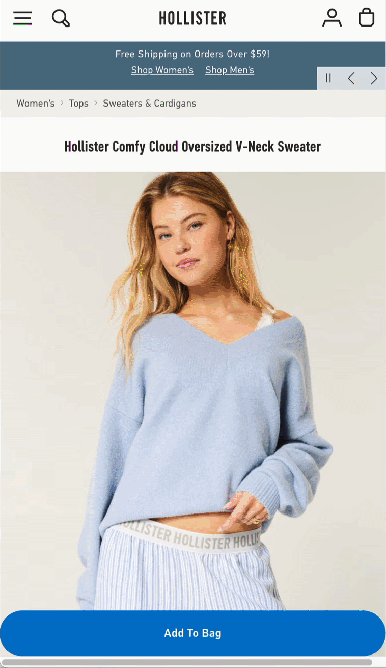
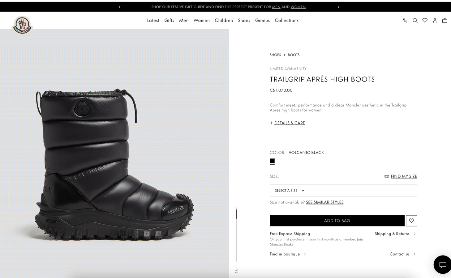
8. Help shoppers find similar items for sold-out SKUs
Much of your holiday gifting traffic will land directly on PDPs — but when the preferred size, color or other variant option is unavailable, you want to keep that customer shopping, rather than returning to search, social or other “pre-click” touchpoint. Rather than leaving them to navigate your mobile menu, providing instant similar results can save a sale. Gifters don’t have time to wait for “back in stock” notifier emails. A few solutions that have this feature out of the box are Syte.ai, Nosto and FastSimon. Examples from Hollister, Alo, Princess Polly and Moncler.
/w=1920,quality=90,fit=scale-down)
/w=1920,quality=90,fit=scale-down)
9. Replace reviews with more products for paid traffic
Steal this idea from LL Bean: give paid traffic more products to explore, rather than product reviews. Why? You risk a bounce back to the shopping source if they choose not to purchase the product they landed on. You’re paying for this traffic — optimize your experience for discovery. (Click to play video):
🚚 Shipping info
During the holidays, you can’t over-communicate information around order cutoff deadlines to arrive by December 24, fulfillment options and estimated arrival dates throughout the shopping journey
10. Link to a shipping cutoff modal from the promo strip
It’s a great idea to show the shipping cutoff in a top-line promo strip, but even better to expand details on-click/tap.
Backcountry’s announcement bar linked to shipping deadline info (with a bonus gift finder CTA inside):

11. Rotate inclusive holiday cutoff dates
Because Christmas isn’t the only holiday, including Hanukkah, Kwanzaa, New Year’s and other winter occasions is a bright idea.
DSW’s banner rotated through 3 occasions, using different color treatments for added pop:

12. Promote a “Get it By 12/24” filter in product lists
If you fulfill from multiple warehouses, local stores or use drop-shipping, it’s a great idea to enable shoppers to filter results by what they can snag by Christmas Eve.
This is an advanced play, but Dick’s Sporting Goods slams with its “get it by 12/24” filter on category and search pages:

13. Feature holiday CTAs with in-grid banners
Victoria’s Secret slipped “See delivery details” banners into product grids for extra visibility:

14. Show estimated arrival dates clearly on PDPs
A 2023 study by Maergo found 88% of shoppers want to see estimated delivery dates on product detail pages, and 53% rated this as “very important.”
But most sites cite delivery times in esoteric business day ranges.
Do customers a solid and provide estimated arrival dates clearly on the PDP — this goes a long way to reduce friction during the stressful holiday season, eliminating the need to dig for this information in the cart, checkout or customer service pages.
Cole Haan shows the arrival date in can’t miss green type:

Fashion Nova combines estimated delivery date with Free Shipping reassurance:

15. Show “Get it by [date]” with countdown timer on PDPs
Chubbies combines its free Standard delivery estimate with its shipping cutoff info in an easy to understand, real-time way on its PDPs:

Missguided shows a “get it by tomorrow” countdown timer, boldly:

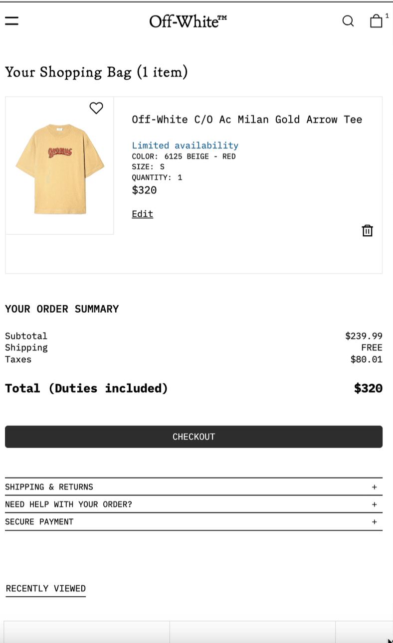
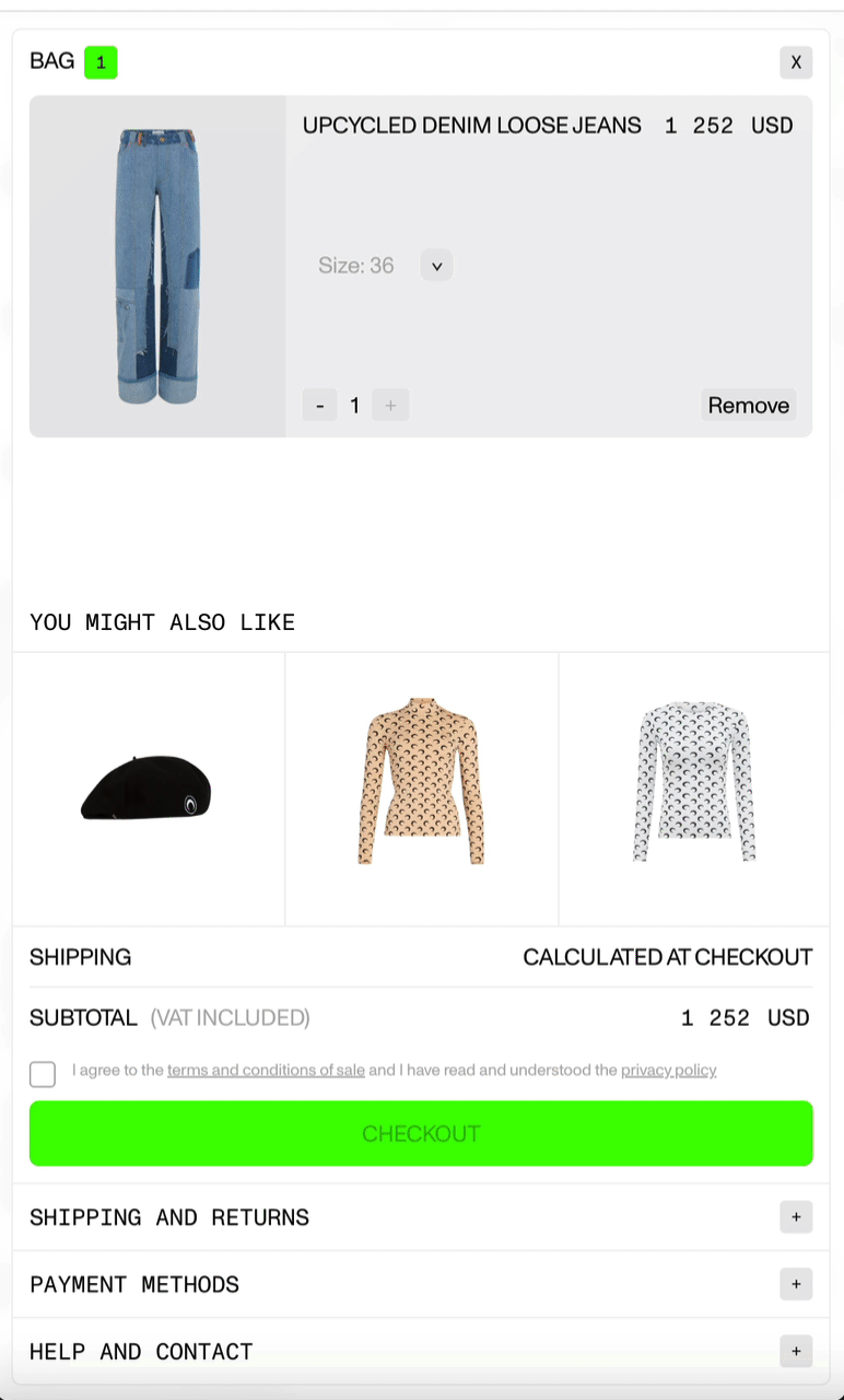
16. Bake shipping FAQs into the cart drawer
The cart is a decision touchpoint. Pulling Shipping, Returns and Payments information right into the cart, using compact FAQ accordions, saves shoppers the effort of hunting for this information in footer menus. These examples are from Off-White (left) and Marine Serre (right).
17. Help guest customers track their order
The holidays are peak season for delivery anxiety — and often shoppers can’t remember if they logged in or just used guest checkout. Lacoste adds a simple “Looking for a guest checkout order?” CTA under the Account tab to help guests track their orders fast. Video demo:
🚗 BOPIS features
If you’re an omnichannel merchant, the clarity and UX of your Buy Online, Pick up In Store (BOPIS) features are critical during the holiday rush, as much of your traffic wants or needs this option.
18. Promote a “Get it today” (store pickup) filter
This tactic is trending and for good reason. American Eagle Outfitters draws attention to it by placing above other filters and accenting with a location-marker icon.

Clicking it pops out a simple zipcode lookup field:

Alternately, try a “Shop My Store” toggle, like Abercrombie (and let logged-in users save their Store Preferences):

19. Geolocate and pre-populate nearest store (for pickup filter)
Remove a step by pre-selecting the nearest local store. Just make sure to provide an override link (like REI, below):

20. Promote store pickup with in-grid banners
Duluth Trading’s animated banner reminds customers they can get gifts on time with curbside pickup, and includes text details below for the 4pm 12/23 order cutoff time:

21. Include “Order by X pm” for same-day pickup on PDPs
Because it REALLY matters during the holidays…

🍒 Low-hanging holly berries
22. Give special treatment to gift links in menus
This is a simple and underused tactic: add a little icon or colored text to your Gifts / Gift Guide collection in your header menus (desktop and mobile). Here are a few nice examples from holidays past:


23. Give your Gifts tab a sub-menu
Why stop at a Gifts link? Take the extra time to merchandise by recipient or interest to help direct customers to a more relevant set of suggestions.
The more relevant the suggestions, the shorter the discovery process and more likely the conversion ;)

Highlight them again on the Gifts collection with promoted banner/tiles:

24. Promote gifting-specific filters in Category pages
Alternatively, you can promote more general filters specific to gifting. “Under $X” are popular scopes, as are quick links to Gift Cards:

Just make sure your graphics look “clickable” and type and text-to-background contrast are user-friendly (these examples could be improved, but you get the idea):


25. Gift card banners
Duluth Trading reminds shoppers (especially late holiday gift givers) about gift cards, with quick-click access to purchase (and some whimsical copy to boot):

Patagonia makes its gift card promo pop by slotting it in negative space within the grid:

Daniela Draper slips an animated Gift Voucher CTA into its filter sidebar on desktop and mobile

📩 Bonus idea: Try an e-gifting option
eGifts are physical gifts that you send electronically with just the recipient’s email address.
The merchant sends an e-Gift card-like experience to your recipient, and the recipient enters their preferred shipping address when they accept the gift.
The idea is gifts are only shipped and paid for if the recipient accepts the gift, it’s great for when you don’t know your recipient’s address or where they’ll be over the holidays.
Untuckit uses the Zest eGifting app to enable eGifting to individual gift recipients (GIF may take a moment to load)

Want more? Check out the Holiday ideas section on Ecom Ideas 💡