Ecom Ideas
  • Homepages & nav
  • Category pages
  • Product pages
  • Cart pages
  • Checkout
  • Site search
  • Internationalization
  • Holiday ideas
  • Featured idea gallery
  • Topical articles
Subscribe

Get daily ideas

LinkedIn
💡
Ecom Ideas
/Category pages
Category pages
/
⏳
Filter & sort
⏳

Filter & sort

Tap any tip to open toggle ⚡ some gifs may take a moment to load

Featured ideas 🦄 are rare ideas you may not have seen before ;-)

❓FAQ

‣
❓Do horizontal or vertical filters work better?
💡
Baymard Institute has published research on horizontal filtering: ”Our usability study showed that a horizontal filtering and sorting toolbar is only appropriate for certain types of e-commerce sites – yet for those sites, it can significantly outperform the traditional left-hand filtering sidebar.” 🥊 They significantly outperform thanks to increased visibility of the filters — they’re simply easier to see and interact with. Eliminating left-rail filters also provides more row slots for product cards. 🥊 The “certain” types that benefit (according to Baymard) are those that have a tight set of filters that can display horizontally without cutting off. Keep in mind, there are design patterns that can leverage both horizontal and vertical filtering. These “hybrids” promote select, popular filters to a horizontal bar, and display the full set in the left rail (desktop) or filter panel (mobile). ⚡ It always comes down to context, UI design and implementation. I’ve included a number of design pattern options from top online retailers in the Ideas and Tips section below.
‣
❓Should you combine Sort & Filter into a single panel?
☝
User research by Baymard Institute suggests everyday shoppers don’t necessarily understand the difference between Sort and Filter. For this reason (presumably), many UI designers have moved towards a combined Filter+Sort button on both desktop and mobile experiences — it saves space, and customers consider them one-and-the same, right? Before the mobile-first revolution, the vast majority of ecom sites showed filters on the left of the product list and a Sort By menu somewhere in the top right. You could argue this is the conventional placement pattern and online shoppers are conditioned to look for Sort by and Filters on the top right and top left of the product list, respectively. The fact is, we don’t have enough specific user research that proves one style is better than the other. A/B testing these patterns is challenging. Modifying filter behavior requires development — it’s not a simple CSS change. Depending on your tech stack, it may be impossible to run without server-side testing, or not possible at all. You may need to workaround this by running serial tests (where you implement one version across all users at a time), and use a combination of event tagging and screen recording tools to observe user behavior. Recording tools like Hotjar, Heap or Mouseflow, you can observe how real users interact with your sort and filter. It’s time consuming, but can show you more qualitative insights than A/B testing or even lab user testing, where participants don’t always behave organically. KPIs to track include: ⭐ Filter engagement (event tag) ⭐ Product click through rates (event tag) ⭐ Page abandonment ⭐ Site abandonment ⭐ Conversion rate ⭐ Revenue per visitor My personal preference is to play safe and keep them separated with clear CTAs for each. I’ve shared some of my favorite examples of this approach in the “Good ideas” section below. Other UX practitioners disagree, and favor the combo approach 🤷🏻
‣
❓Should you autoload results after every filter selection, or use an Apply button?
💡
Customers that use filters often want to apply more than one at a time. The worst thing you can do is force a page refresh after every. single. filter. application. (Especially on mobile - many sites will collapse the filter shelf after each filter selection - how rude!) Many sites have adopted asynchronous loading as the user applies filters. On desktop, this happens seamlessly in the background. The left-rail or horizontal filters remain exposed throughout the process, and the user doesn’t need to indicate they’re “finished” by hitting a single Apply button. On mobile, however, the filter shelf typically covers list results, and it’s not clear that results are updating in real time. Filter lists can also be long and require scrolling to view all options. Pinning a sticky “Apply” or “Go” button to the top or bottom of the filter shelf ensures customers understand they can select multiple filters and submit them in one-go, while keeping the action button at their fingertips. That said, ”Apply” buttons on desktop are unnecessary. TL;DR: Load results asynchronously after every filter submission, but for mobile users, add a sticky Apply button that closes the filter shelf.

💣 Loading the page after each filter application is a reason to drink

image
‣
❓Should you rank filters by popularity, number of results, or alphabetically?
💡
This depends on the filter group! Depending on what serves your front-end filters (your commerce platform or search/merchandising application), you may be able to apply different logic to different filter sets. 🔤 For example, long lists like Brand/Manufacturer, Ingredients or numeric lists are best sorted ascending — A-Z or in numeric order. ↕️ Other lists, like Color or Style may be best served in order of population (number of matching products — not to be confused with popularity, or click-through frequency.) 📶 Still, you may decide that relevance (relative importance) matters more than how many results match. This may be manually decided by your in-house merchandising experts, or automatically through machine learning in your personalization engine. ⚡ If you can’t customize sort order by filter group, you’ll need to make a universal decision. The safest sort order in this case is population, so the least populated options appear lowest in the list. This is essentially an automated option, as it pulls from real-time catalog data. It’s best to visually communicate this logic by including the number of results (in brackets) for each list item — otherwise your list may appear random to users. ⚡ Note the exception is for price or other numeric-range filters, which should always be in ascending order.

👉🏽 This merchant sorts Colors by A-Z, hiding colors like White that may be more populated (or popular). Ranking by the number of matches or click-through data would be a better user experience.

image

👉🏽 This merchant’s list shows no apparent sort order logic, but may be ranking itself by click-through via its personalized search application. Keep in mind truncation can skew machine learning — visible links naturally attract higher click through.

image

💡 Ideas and tips

Menu layout

‣
Consider a horizontal filter pattern on desktop
💡
See the FAQs above for more info on horizontal filters 👆

🧦 Bombas’ horizontal filters support multi-selection, dynamically display the number of matching results, and auto-update the grid after each selection

image
‣
Use a “peekaboo” menu for horizontal filters on mobile

👗 Macy’s promotes specific filters next to its Filters button. When filter chips appear cut off on the right side, it indicates you can scroll right for more 😃

image
‣
Make your horizontal filter chips POP against a colored background

💥 Ruggable’s filters are given extra visibility against a shaded background bar

image
‣
Promote most-used filters to the category header
💡
Many shoppers don’t bother to open your filter menu — especially on mobile where it’s always collapsed by default. Promoting helpful or commonly used filters to the header space makes it easier for shoppers to discover and use these helpful winnowing tools.

👠 Fashion Nova displays frequently-used filter menus front-and-center, with the rest tucked neatly behind its filter menu icon

image
‣
Promote category-specific filters to the header

💡 Lamps Plus promotes specific filters, depending on the Category context

Barstools

image

Ceiling Fans

image

Table Lamps

image

🧦 Bombas promotes them to the hero banner!

image
‣
🦄 Promote a Get it Today filter (for store pickup or same-day delivery)
💡
This is becoming more and more popular for omnichannel shops and stores/marketplaces that offer same day delivery for select items (based on warehouse location and inventory levels). ⚡ To reduce friction, auto-detect the visitor’s nearest store using geolocation — but make sure to provide an override for visitors, as geolocation is not always accurate, and shoppers may be browsing from a location other than their preferred shipping address.

🦅 American Eagle Outfitters’ “Get it Today!” filter (top left) requires you to enter your zipcode

image

Zoomed in:

image

🥾 REI uses geolocation to auto-apply the nearest store, with a blue link to Change store

image

🛒 BJ’s Wholesale prioritizes delivery filters with Pickup, Delivery (local courier) and Shipping chips

image

🎯 Target takes a similar approach

image

Zoom:

image

👖 Abercrombie uses a Shop My Store toggle that opens a lightbox to choose your store

image

👕  Old Navy takes a similar approach, but places it below other filters

image

Zoom:

image
‣
Promote active promotions to the top of your filter list

🛍️ Macy’s highlights current offers in can’t-miss-red type

image
‣
Consider a “You are here” indicator

🧥 Burberry shows the count of how far you’ve scrolled through a product list in the top left

image

Sort menu styling

‣
Provide a clear visual distinction between Sort and Filter
☝
As explained in the FAQ section above, separating Sort and Filter follows long-standing Web conventions we’ve been conditioned to from traditional desktop UI. Make sure to place Filters on the left and Sort on the right, and box them (rather than use simple text links) to make them more visible as actionable functions.
image
image

🦉 Bellroy simply displays Sort as an active dropdown, with Most popular visible. This can help users who don’t know the difference between Filter and Sort by labels alone

image

💋 Avoid reversing this order, it can throw customers off…

image
‣
If you combine Sort + Filter, style the button like a primary CTA
☝
Filters help customers convert faster by narrowing the set of results and shortening their decision journey. They can also help inform customers about buying criteria they weren’t even thinking of. When filters are tucked away behind a button, they’re less likely to be used. It’s important to style your buttons to MAKE THEM OBVIOUS, which can include: ⚡ Styling them as buttons rather than text links ⚡ Using color ⚡ Adding icons ⚡ Placing them in an easy-to-find, conventional location ⚡ Avoid placing them too close to competing UI elements

⚡ Sort & Filter button with icon and gray button styling

image

⚡ Clear button with icon, given enough white space to stand out

image

🌩️ Text links (especially underlined ones) can easily be drowned out by other elements

image
‣
If you combine Sort + Filter to a single menu, auto-expand the Sort list

🦅 American Eagle Outfitters provides additional clarity around the Sort section by exposing the list fully. This also visually distinguishes the Sort options from attribute Filters, which each have their own heading label

image

🌩️ Contrast the above with a collapsed Sort menu. Even when placed above other filters, it’s less clear why a user should interact with it

image

🌩️  Similarly, a collapsed menu that “doesn’t look like the others” may fall victim to “banner blindness,” despite its more prominent visual treatment — especially with the tiny superscript label

image

😑 This example is EVEN HARDER TO SEE 😑

image
‣
Style your Sort menu as a call to action

🙈 If you style your Sort menu too subtly, it can get lost in the mix — how long does it take for you to find the Sort menu below?

image
‣
Give your Sort menu an icon

🥖 Ted Baker’s Filter and Sort icons provide a visual hint at the difference between them

image
‣
Consider a Percent Off sort option (for Sale collections)
💡
If your customers are the deal-hunting type, offering a Percent Off sort option can be helpful. You may be able to selectively apply this to Sale and Clearance categories, depending on your ecommerce platform. If you apply this option across all categories, keep in mind full price items will still appear, though at the bottom of the list.
image
‣
Consider a Most Reviewed sort option
💡
We’ve all seen the 5-star products with only 1 or 2 reviews. The “Most Reviewed” option combines “Best Selling” with “Top Rated” values — your customers may appreciate this!
image
‣
Apply custom design to your Sort menu
💡
Many ecommerce sites don’t apply their own UI for the Sort menu, instead using the default O/S.
Example of default OS menu styling - AKA “no style”

Applying your own style enables you to: ⚡ Make tap-targets larger and more finger-friendly for mobile shoppers ⚡ Apply type styling to emphasize selected or featured sort options ⚡ Apply emoji to list items ⚡ Add special markers or other UI styling to enhance usability ⚡ Keep your brand experience and design system consistent throughout

🔥 Much better:

image
image
‣
Highlight your currently applied sort option

💡 Applying a highlight and/or checkmark to the currently applied option provides clarity to users. Will it dramatically increase conversion? Of course not. But it’s a nice touch

image
‣
🦄 Consider a “nudge” effect in your mobile shelf

💡 If you combine Sort & Filter menus together on mobile, consider adding a little wiggle to draw attention to the Sort menu, like Urban Outfitters. This also hints that horizontal scrolling will show more options

image
‣
Try emoji bullets

🍎 Cider adds whimsical flair with Sort menu emoji bullets — in its collapsed state the “thumbs up” emoji grabs extra attention!

image

Filter data and behavior

‣
Expand only the most useful/popular filter accordions by default

🎧 Crutchfield auto-expands Brand, Price, Customer Rating and Availability by default, saving users a tap to open, and keeping the menu tighter than if all were auto-expanded

image

🍏 Cider expands all sections by default, requiring users to scroll, and scroll, and scroll. (See the “makeover” experience below, if they simply collapsed all but the most used sections)

image

🍎 The Cider “makeover”:

image
‣
Keep sort and filter buttons sticky on mobile

⌚ Fossil keeps controls at users’ fingertips as they scroll through the product list (if this gif loads slow, skip to the static image below)

image
image

👗 Kohl’s keeps applied filter chips visible for quick modification

image
‣
Provide contextual attribute filters at sub-category levels
💡
Building category-specific attribute sets (assigned by “product type”) helps customers drill down to specific products that match their buying criteria. Showing category-specific filters also helps customers understand the specs they should be considering that they may not even be aware of. Think of it as “guided selling.” ⚡ This can give you a competitive advantage over other retailers, and shorten the path-to-purchase. It can also provide keyword-rich landing pages to feed search engines. This does require very granular product data management and attribute tagging to work. You’ll need to develop a taxonomy and a process for appending existing products and future uploads, and include QA (quality assurance) in this process. AI tagging may help, but it’s not fool-proof. You’ll also need to define where these filters will be displayed within your commerce platform or search/merchandising tool (if Search controls your category/collection pages). Search results and thematic categories that include multiple product types within the list may pull these filters, leading to clutter and a poor user experience. It’s safest to apply them only within your standard categories, where relevant.

⌚Crutchfield shows it deeply understands its product specs, providing custom attribute filters at the sub-category level for Sport & GPS watches (Maps, Music Storage, Activities, Digital Wallet, Microphone). It provides similar scoping for all major categories.

image
‣
Sort list items by number of results (where appropriate)
💡
Not all filter section lists need to follow the same sort order, but for sections with more than 8 list items (such as subcategories or Color), ranking by number of results can be helpful — and showing the number of results in brackets helps customers understand your ranking logic. ⚡ Keep in mind that number of product results isn’t always the most helpful sort order — in some cases alphabetizing (e.g. for Brand) or most browsed categories (popularity / click through) is better. Use your judgement on a section-by-section basis.

👗 ASOS ranks its Category filters by number of results when browsing the top-level Women’s department

image

💄 Some merchandizing tools will auto-rank lists by click-through engagement, showing the most applied filters first. This can be far superior to A-Z ranking, especially if attributes like “Vegan” and “Sulfate-free” are the most popular

image

🚲 REI ranks subcategories by number of results, with the ability to drill down to a 3rd category level (+)

image
‣
Offer a Search box for long filter lists

👗 Nordstrom carries hundreds of brands — requiring a lot of filter-list scrolling. Its inline search box lets customers beeline to their faves quickly:

image

💄 Sephora lets you search by ingredient

image

📸 BH Photo lets you search across all filter lists (aka “within results”), but places the box below all filters. Not all users will spot it at the bottom

image
‣
🦄 Try nested multi-level filters

🍷 Wine.com’s Region filter lets you drill-down three levels deeper without leaving the widget

image

🛋️ IKEA’s Size filter lets you scope by Width, Height and Depth from the same dropdown

image

👖 H&M’s sub-filter menus are cool — but some have a large number of values!

image

👖 Another example from NA-KD with large tappable chips and the # of results displayed dynamically

image
‣
Group size families together (vs one mashed up uni-list)
💡
If your sizes span multiple departments (Men’s, Women’s and Kids) or conventions (e.g. US and Euro sizes; or Petite, Tall, Plus), or display both numeric and alpa ranges, the WORST think you can do is lump them all together in one hot menu mess. (Better examples below👇) Exhibit A:
image

Exhibit B:

image

Exhibit C:

image

🏆 Lily Pulitzer deserves a prize for this improved pattern

image

🪷 Lululemon takes a similar approach

image

👗 Revolve’s horizontal filters display multiple size groupings nicely on desktop

image

💣 Back to more bad examples (because there are just. so. many…)

image
image
image
‣
Don’t be afraid of scrollbars (desktop)
💡
If you want to keep filters visible as users scroll through long sets of product results, consider pinning your filter menu and providing an inline scrollbar. These are somewhat controversial, as Baymard Institute reports that users often have trouble with scrollbars: ”Additionally, our research across studies indicates that inline scrollable areas can be troublesome for users to interact with, in particular due to the risk of “scroll hijacking” (where users are scrolling the main page but then inadvertently scroll the inline scrollable area) and difficulty with clicking and dragging the small scrollbar.” For this reason, it’s best to keep this pattern for desktop users only. But keep in mind, a vanishing filter menu can be just as problematic as a finicky scroll panel, and the usability of your menu always comes down to implementation. Arguably, it’s the tiny scroll panes that are the actual problem. ⚡ You can always run a tool like Hotjar or Mouseflow to observe how your actual customers use your filters, and diagnose any UX problems they may be having — with or without scrollbar elements.

👟 When it comes to scrollable filters, Nike just does it.

image
‣
Truncate long lists with a “Show more” link
💡
There’s a UX myth out there that you should display no more than 7 links in a navigation, dropdown or filter list — this originated via psychology research from the 1950s, which found that humans can hold, on average, 7 +/- 2 items in our short term memory. Somehow this became the “magic number” for Web lists, but ecommerce sites don’t need to cater to memory and recall because the list stays visible! That said, truncating lists to a reasonable size for scannability and use of vertical space is a sound principle. Baymard Institute suggests capping at 7 links so users can get a better view of all filter options available: “A truncated list of options allows users to get an overview of all the filter types available, but when expanded it also allows users to get an overview of all filter options for each type.” However, A) this assumes that you have a reasonably short set of filter options to begin with, and B) doesn’t account for the ability to display a large number of filter sections as collapsed accordions, and selectively display important sections expanded. For your specific, category-level use case, it may be the best user experience to show more than 8 links at a time within a given filter subsection. Context is king. Likewise, showing only 4 or 5 links (as in the example below) may add the friction of expanding a list. But context is king.

💊 RiteAid only displays 4 brands, this may be fine if the 80/20 rule applies to these top links. Or, it may require most users to “Show more.” Use your data and your common sense in your own scenarios.

image

📸 BH Photo applies a color and the number of hidden options for better visibility!

image
‣
If you use price sliders, provide text field fallbacks
💡
Price sliders are nice on paper but can be difficult for customers to use — especially on mobile devices. Consider that the right slider range (min/max boundaries) can be fuzzy, and different categories/collections may have different “optimal” ranges — e.g. Appliances vs Cleaning Products. Also consider that the sliding scale you choose can make it hard for customers to intuit, and to precisely hit their preferred min/max ranges. In my opinion, all price sliders should be dropped in favor of min/max input fields 🤷🏻‍♀️ But if you have a strong use case for a slider, make sure you provide text box alternatives, for users that have difficulty fiddling with the widget. I’ve noticed many Shopify themes in the Theme Store (and 3rd party marketplaces) show only sliders without fallback input boxes — this is a key criteria you should consider when choosing a Shopify theme.

🥖 Ted Baker bakes input boxes with its price slider

image

👱🏿‍♀️ Amika has a tight DTC catalog that falls within a narrow price range to begin with. In this case the slider’s scale of max $75 is not the worst…but still would benefit from text input boxes (but note that the slider blends in with the other horizontal spacers in the menu)

image

😁 Or just don’t bother with sliders, and just show Custom input fields with pre-defined ranges

image
‣
Consider filter nudges for long lists

👗 Marc Cain shows a filter nudge on categories with a large number of results, such as Shop All and Sale (but not on regular categories)

image
‣
🦄 Use toggles for sections with 2 important attribute groups

🛋️ Vetsak has a perfect use case for filters toggles — some fabric variants are suitable for both indoor and outdoor use. The filter tab clarifies what’s not obvious at the Collection level, and helps customers think about their buying criteria earlier in the funnel.

image

See how the toggle UI is super obvious. No “tab blindness” here.

This is an idea to consider if your variants have “subgroups” within an Option type, or attributes that distinguish them that are important to the buying decision 😉

‣
Try a shifting grid

👟 On’s desktop grid shrinks in scale to make room for the left rail filter menu

image

🎒 Sandqvist does similar, instead shifting from a 3x to 2x grid

image

Filter panel behavior

‣
Make it clear which filters have been selected
💡
Make it OBVIOUS when a selection has been applied - you want customers to be able to review before closing the filter panel, and quickly modify applications when returning to the panel.

⚡ Ruggable applies a shaded highlight to selections

image

… and indicates which options have applied selections before you proceed to results, and when you return to the panel

image

🦉 Bellroy fills the checkboxes with a poppin’ color

image

💄Compare the above examples to Kylie Cosmetics’ simple bold text — it’s much more difficult to see what you’ve applied

image

🧘🏼 While it’s tempting to save space by simply indicating how many filters were applied, this doesn’t help customers recall their selections and quickly remove individual filters without expanding the panel

image
‣
Include a very conspicuous Apply button

😎 Easy to see, easy to use!

image

🎯 Target’s clear Update button is easy to understand, and you can start over in one shot with Reset

image
‣
Show number of matching results on the Apply button

👗 Fashion Nova indicates how many results will display after submitting your filter selections — this is great for customers who may want to remove their less-important filters (especially if less than 10 results match)

image

👔 Ted Baker lets you know how many products you’ll see after closing the panel. This gives you a chance to refine to increase results, if desired.

image

Filter menu styling

‣
Make your link targets tap-friendly

🔗 Button-style links are more tap-friendly than tightly-packed text links. Test it!

image
image
‣
Consider tooltips for filter headings where additional context is helpful

👆Crutchfield adds definitions to help shoppers better understand what they mean — this is great for technical specifications, jargon and other unconventional filter types

image

🛍️ Saks Fifth Avenue informs what its unique “My Designers” feature is for with a tooltip

image
‣
Include contextual illustrations where relevant

🩳 Chubbies provides a visual for the relative 6” and 8” inseam styles

image

🛋️ IKEA’s icons illustrate relative cushion firmness

image

💍 Ritani’s icons illustrate stone shape, particularly helpful for industry-specifics like Baguette and Princess Cut

image

🔥 Kettle & Fire’s icons are cute - but may not be necessary here. When combined with checkboxes, they add clutter and makes it doubly hard to scan link text

image
‣
Consider descriptive microcopy (where appropriate)
💡
If your filter labels are highly specific to your own brand (such as Alo’s fabric classes, below), users may benefit from short descriptions that are not hidden behind a tooltip (Make sure to user test or A/B test this pattern if you try it, as it can be more distracting than helpful — and your design styling can make all the difference!)
image

✈️ As a D2C brand with a unique value proposition, Away provides definitions and detail for filter items where relevant. Check out the mobile view below:
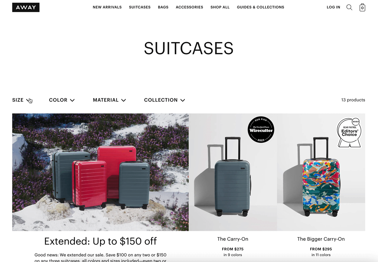
image

Mobile:

image
‣
Consider image thumbnails, where relevant
💡

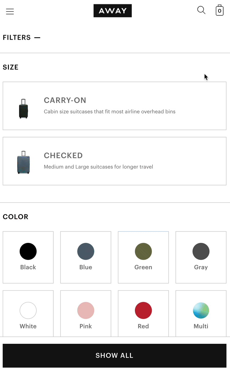
Image thumbnails can provide additional context around link items that otherwise may be obscure, make tap-targets more mobile finger-friendly, and can add some visual interest to your menus Keep in mind they also can slow performance and may add too much visual clutter. It’s worth A/B testing if you think this approach will work for your site

🛠️ Ace Hardware includes thumbnail images with its filter chips, this helps customers scan quicker without having to read word-for-word

image
‣
Label your color swatches

💡 Help colorblind users by labeling your color swatches. This also helps identify ambiguous colors like “multi-color,” “tie-dye,” metallics and “Solid” (whatever that means..)

image
image
‣
Consider separating Categories and Sort & Filter menus
💡
This is an uncommon pattern, but could support mobile users better by separating Sort & Filter from Category drill-down, rather than lumping them into a single, overly cluttered filter panel.
image
‣
🦄 Break sizes into sub-groups for cross-category collections

🧠 Size filters can be very hard to navigate when all size groups are mashed together (see below for BAD examples!) Revolve smartly breaks sizes into Numeric, Bottoms and Shoes for macro-categories like Sale that span multiple departments

image
‣
🦄 Try an animated banner inside the filter sidebar

👗 Daniela Draper slips a Gift Voucher CTA in its desktop and mobile filter menus. The animation draws additional eyeballs ;)

image

Filter results (post application)

‣
Make your applied filter chips POP  
💡
It’s remarkable how few merchants give their applied filters “obvious” styling treatment. Most use simple text links that fade into the background. You want applied filters to be uber-noticeable so users can see what has been applied and easily remove filters individually or all in one go.

🔪 Dolls Kill’s pink chip draws attention to all applied filters, with a quick way to clear ‘em all

image

🧘🏽 Lululemon’s clear boxes don’t compete with other links

image

👗 Anthropologie’s chips are clear, with a blue Clear All link

image

💊 Color-filled pills are also easy to see

image

😃 Looks good on mobile, too!

image

🙈 Contrast the above with the typical text-links that are overshadowed by other elements

image
‣
🦄 Request customer feedback on your filters

⚽ Dick’s Sporting Goods asks customers to “Tell me what you think about our filters!” at the bottom of the product grid. It doesn’t hurt to capture real customer sentiment. (If the GIF is slow, see the static image below!)

image
image

Creative filter ideas

‣
Try a “Just dropped” recency filter

🧘🏽 Alo Yoga caters to the segment of “site stalkers” with recency filters so raving fans can discover new items since their last visit

image

🎿 Backcountry uses this too, and quantifies the number of results

image
‣
Consider a % Off filter
🏷️
Help customers hone in on your best deals with a tiered % off filter ;) You may be wondering how to map discounts to which filter value — for example, would a 38% discount fall in the 30% off tier or 40%? Personally, I like “XX% off or more” as it solves for the above and provides more clarity to shoppers…but that approach doesn’t need multi-select checkboxes, single-select radio buttons will do.
image
image
‣
Consider a “Hide out of stock” filter

🛠️ While you may bury OOS products by default, lists can re-rank themselves after Sort is applied - this filter can help the user control their results

image

Zoom:

image
‣
Include a Sustainable section
🌱
More retailers are highlighting sustainability across the customer journey and at every shoppable touchpoint. Consider making it its own filter section, if relevant to your catalog, and/or combining it with other value-based filters like social responsibility attributes
image
‣
🦄 Let customers apply custom filters from saved profile data

🛍️ Saks Fifth Avenue lets you create a favorites list for your fave brands (or categories, or sizes), and save as a custom filter. It’s also a great way to encourage account creation to capture first party data ;-)

image

🛍️ Inside your Saks account, you can save preferred brands, categories and sizes for quick filtering

image

🛍️ Just apply the Preference filter and bypass scrolling through the 200+ item Designer filter!

image
‣
Promote % off filters to header in Sale and Clearance collections

🧠 Fashion Nova promotes New In Sale and % off above product results. Kinda genius

image

Zoom:

image
‣
🦄 Include Size filters in Sale and Clearance collections

🧠 Fashion Nova helps you winnow thousands of sale results with a single click by embedding a Select Your Size filter block. This is especially helpful for clearance sections where variant inventory is very spotty (this GIF may take a sec to load, see static image below for context)

image
image

🧠 Alo serves them front-and-center above product listings, with a “Just Added to Sale” section for the sale-stalkers ;-)

image
‣
🦄 Promote a “Get it by [date]” filter for time sensitive occasions
🏆
This is an advanced move - but if you can push inventory data from your OMS and connect it with shipping speed options within a given geo-targeted region, you can enable filtering for “Get it by XX” for specific holidays or events. As you get closer to such a date, this becomes more critical for customers and can help shorten their path-to-purchase and increase conversion. Just make sure your logistics carriers truly can deliver on your promise!

🏈 Dick’s Sporting Goods lets you filter by inventory that can reach you (based on your geolocation) by a specific sensitive date — in this case, Christmas Eve

image

Zoom:

image
‣
Build an interactive map as “regional” filter (e.g. wine)

🍷 Wine.com understands Region is an important attribute to its products, and built a custom interactive map that you can toggle from standard text filter. This use case can apply to many industries, so long as it’s relevant to the product!

‣
🦄 Try a this-to-that attribute slider

🐆 J. Lindenberg's Mild-to-Wild slider is an advanced merchandising ninja move 🥷🏿 the slider calls up products tagged with specific attributes. This could have many non-apparel use cases as well (colors: neutral to bright, etc)

image

🫣 Cautions

Filter data and logic

‣
ALWAYS audit your filters category by category
💡
Even the biggest ecommerce sites get glitchy - make sure you regularly check under the filter-hood for values not passing correctly, and irrelevant filters slipping through In some cases, you’ll discover you need to create more specific attribute sets than what you currently have (e.g. for size values that cut across departments)

😲 This merchant’s clothing and bedding sizes have found their way into the same filter menu…

image

😲 Oopsie! This needs a dev ticket to investigate why fields are passing through this way…

image

😲  What does “SELECT A VALUE” mean?

image

😲 Attributes can easily slide into the wrong category’s filters

image

🎩 Always put your customer hat on and ask yourself “is this a good experience”?

image
‣
Keep filters out of your Sort options!
💡
Occasionally, you’ll find a Sort option that’s really a Filter. For example “New Arrivals” or “Just In” is actually a sub-set of results — aka a filter attribute. Newest is a Sort option that will rank products in descending order of freshness. ”On Sale” is another filter that occasionally gets slotted in the Sort menu. Don’t let this happen to you!

💡 Avoid sort options that really should be filters, like “Just In” or “On Sale”

image
image
image
‣
Consider dropping star rating filters
⭐
It was a good idea on paper…but in practice, who needs star rating filters for product lists? They’re perfect for filtering actual customer reviews, but somehow they escaped the lab and found their way in top merchants’ Category sidebars and they’re just taking space. Unlike customer review submissions, products themselves are rarely “round numbered” values, leaving you with the dilemma, where does a 3.5 star product go? Does a 5 star checkbox only pull those unicorn products with a single, 5 star review? Does that help shoppers? And who wants to browse anything 4 or below? Let them sort the list by average star rating instead.
image
image
image
‣
Avoid overly tight or loose price tiers

🚧 Make sure the tiers you choose map to your customers’ needs. For example, $25 increments are likely too granular for higher end apparel, creating a list of 17 options

image
‣
Beware of data gaps in numeric-range filters
💡
It’s wise to display filter options only when matching products exist, most of the time. The exception is for numeric ranges, where missing tiers can make your site look broken. If your filters are set up to only display values with matching products, you can get tiers displaying with obvious gaps:
image

Depending on your commerce platform’s filtering logic, you may be able to correct this by: ⚡ Displaying all tiers, with no-match options grayed out, or ⚡ Display number of results in (brackets) ⚡ Using an “up to” range instead of tiered values What’s more, you may want to customize tier ranges by Category, depending on product type. For example, an Appliances category should show wider ranges with higher dollar values than small accessories and add-on collections.

This doesn’t just apply to prices, age ranges or any numeric value can display all-funky (although it’s likely that customers are more forgiving for age gaps than pricing)

image
‣
Make sure your international price tiers make sense

🤑 If you have country-specific domains or enable localization (with currency conversion), make sure your pricing tiers don’t display with odd values

image

🤑 They’re even harder to digest in horizontal layout!

image
‣
Always define units of measure (where relevant)

❓ Is this inches, millimeters, feet, kilometers?

image

Menu styling and layout

‣
Place your Sort menu in the top right position
💡
It’s always risky to break web design conventions — web users are conditioned by other websites to expect things in certain spots. Getting creative can confuse customers.

😬 IKEA breaks convention and puts its sort options to the left of its filters. Users that want to beeline to the Sort and expect it in its typical position won’t see it (and may click All Filters unnecessarily)

image
‣
DON’T USE ALLCAPS
🗣
There’s no reason to SHOUT AT USERS — especially when other sections use mixed case. ALL CAPS ARE SIMPLY HARDER TO READ THAN MIXED CASE. 
image
image
image
‣
Avoid tabbed design patterns
💣
Tabbed content is always harder to spot!

😬 Doubly troublesome here is this merchant doesn’t label the tab ‘Sort’ but applies the default value “Newest” to add to the obscurity

image
‣
Don’t use radio buttons when you should use checkboxes
🔘
Radio buttons should only be used for single-select options (e.g. Sort). Most filters warrant multiple selection — choosing a circle style for multi-select is an anti-pattern
image
image
image
‣
Be careful with 2+ column lists
🚧
Many UX research labs including Baymard and Speero have found that single-column forms are easier to complete (and preferred by users). But what about filter lists? Though users don’t need to input anything, they still need to scan your list items to understand them, which may take any of these patterns:
Image source
Image source (and good info on the topic)

You may save vertical space when implementing 2 or more columns within your filter panels, but consider the cognitive load on your customers. How do you feel about the examples below, as a user

image
image
image
image
image
‣
Make sure sticky elements don’t cover your Apply button

🤷🏽 Self explanatory:

image
‣
Avoid list items that break over 2 lines

😑 Sometimes it’s unavoidable (heck, I can’t control it on my OWN site Ecom Ideas!), but write an SOP for max character length, or fix your implementation if you’re an ecommerce site

image
image
‣
Don’t underline list items

😑 OMG, they’re so much harder to read. Who’s underlined links since 2004?

image
‣
Avoid using colored links for all filter list items
👓
Colored type is best selectively applied to highlight links you want to emphasize, rather than style your entire list (e.g. Sale links, “See more” or Holiday). Colored type is lower contrast with the background (yes, even white backgrounds) and Google may even detect it as an accessibility issue when crawling your site. Keep in mind many colorblind users see greens (or other colors) as shades of gray.
image
‣
Don’t get TOO creative with Sort options

🤔 Some of these things make you go “hmmmmmm…”

image
‣
Don’t use too many characters when abbreviations will do

😱 mm would be fine

image

😱 A-Z, Z-A is enough

image

😱 One CAD is good. (Speaking as a Canadian)

image

😱 $XX to $XX is all ya need

image
‣
Don’t align your list items like a tag cloud

😱 Ragged alignment runs you ragged

image

Back to Category page ideas

👉 Follow on LinkedIn for daily ideas 💡