Tap any tip to open toggle ⚡ some gifs may take a moment to load
Featured ideas 🦄 are rare ideas you may not have seen before ;-)
💡 Ideas and tips
Thumbnail image effects
👢 Bootbarn draws attention to a featured item by swapping in the video/GIF to the primary position, pushing it to the Category grid. Use this tactic selectively to avoid sensory overload!

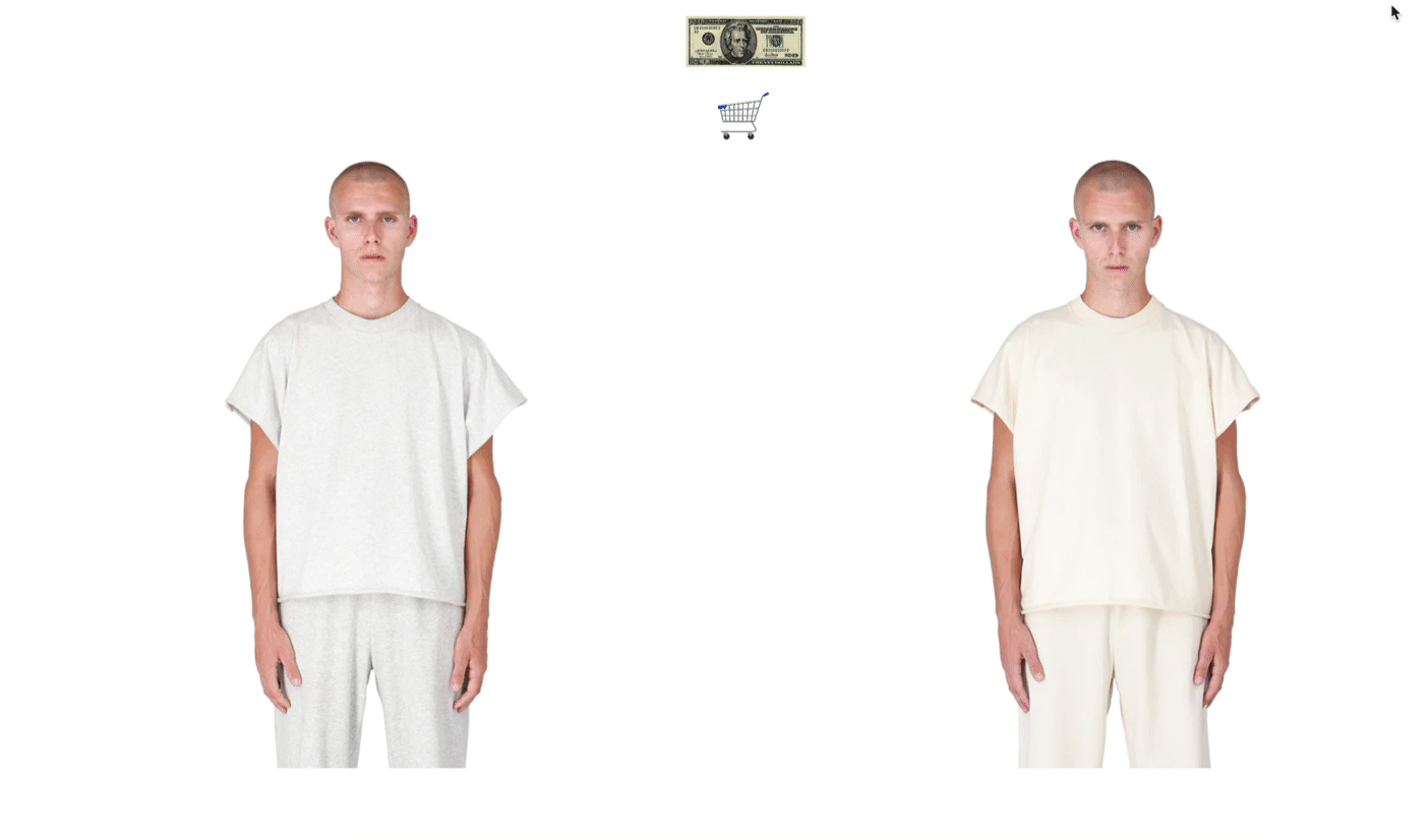
👕 Subset pairs on-model with flat-lay and review summary

Check out the desktop view:
☠️ TattooX alternates model and flatlay with a colored background to POP!

Desktop view:

🧥 Maimoun shows 2 versions of the model shot

Notice the hover effect on desktop boxes in the card

Not all merchants enable mobile users to swipe through product tiles in the collection grid. Even with < and > markers, it’s not intuitive to users to try the swipe
👢 Hereu and Nanushka animate the first 2 tiles when you land on a PLP to drop the hint


This effect persists on desktop. Why not? 😊

🛝 Desigual puts mobile browsers in control with a gallery slider. The design pattern may not be intuitive to all users but beats the hijack-to-PDP behavior most mobile images execute when images are tapped intentionally or unintentionally

📿 A static image doesn’t tell the story of Puravida “Mental Health Awareness Fidget Ring” like a spinning demonstration can

📿 It’s arguable whether customers buy the Puravida’s Pride Collection Box for the rainbow packaging or the contents — the animated demo shows off both

💕 Lovepop’s animated thumbnail tells the story of the “Endless Nesting Card” better than the title can

🍸 Skinny Mixes demos how you can enjoy their syrups for different flavor variants

🍼 Consider placing your product infographics in the “swap image” position so shoppers can get additional context and product info before committing to a click. Of course, readability of infographic details makes or breaks this move (and it will only impact desktop)

💊 UMZU is another example

✈️ Away Travel swaps its flag copy on rollover (desktop only) to show additional context. If nothing else, the pattern is interesting and gives you the ability to add multiple messages for engaged users

👗 Whiskii animates its product tile to show different outfit combos available in its “Scallop Set Bundle”

🧸 Cubcoats flips through every step of transforming its stuffie-to-hoodie products on hover. While this is a hover effect in this example, the animations could also be the primary tile (though in this case the constant motion would be overwhelming, you know - like the Ecom Ideas featured gallery 😛)

🌪️ YZY models rotate on hover — of course, this is desktop only but pretty hypnotic
🦙 Cotopaxi annotates certain product tiles with a one-liner description

📸 Aether Apparel’s desktop lists show a flipbook effect on hover, with arrows to scroll through product shots

📸 On mobile, the “peekaboo” effect suggests you can horizontally scroll through images

👸🏻 Princess Polly lets you preview product pics without leaving the product list (and select your size to boot)

👸🏻 On mobile, notice the < markers > are visible over every card

☕ Tropeaka knows packaging can be just as persuasive as product in CPG, strategically auto-rotating

You can also limit the number of products you apply this effect to -- choose 1-3 flagship products, test for click through and conversion…you know the drill Get more site speed tips in the article: Keeping Commerce Performant: Expert Tips for 11 Ecom Trends
👟 Rollie shows a Play icon with its product thumbnail for user-initiated demo. The best part? It works on mobile ;)

💙 H&M places its hearts bottom right, along with their sale badges for better visibility
🌈 Abercrombie dressed up its PLP grid with different color background tiles for its Pride Collection
💍 Bvlgari adds an elevated brand touch with ombre tiles that shift color while you scroll - see performance tips below
𝗕𝘃𝗹𝗴𝗮𝗿𝗶's PLP tiles use CSS gradient overlay for a luxe scroll experience 💎 if you try this, keep 𝗮𝗰𝗰𝗲𝘀𝘀𝗶𝗯𝗶𝗹𝗶𝘁𝘆 and 𝗽𝗲𝗿𝗳𝗼𝗿𝗺𝗮𝗻𝗰𝗲 in mind:
🎞️ 𝗙𝗿𝗮𝗺𝗲–𝗿𝗮𝘁𝗲 𝗶𝘀𝘀𝘂𝗲𝘀:
If using JS scroll listeners, make sure they're debounced or optimized (e.g. with IntersectionObserver) or they can cause jank and lag, especially on mobile
🎨 𝗥𝗲𝗽𝗮𝗶𝗻𝘁𝘀 & 𝗖𝗦𝗦 𝗲𝗳𝗳𝗲𝗰𝘁𝘀:
Using mix-blend-mode, large gradient overlays or changing styles per frame can trigger repaints that can be costly and add up across many tiles in a long product list
You may want to reserve this effect for smaller, themed lists or grid sections within a landing page (a few rows at a time, separated with banner images)
🏋️♀️ 𝗥𝗲𝘀𝗼𝘂𝗿𝗰𝗲 𝗹𝗼𝗮𝗱:
Extra CSS, JS (for viewport scroll detection) and paint/tick cost increases the bundle size and memory footprint
You can reduce or eliminate JS with CSS scroll‑linked animations (view transitions, @scroll-timeline or scroll-snap) although this is not supported by all browsers (yet)
🦾 𝗔𝗰𝗰𝗲𝘀𝘀𝗶𝗯𝗶𝗹𝗶𝘁𝘆:
Users with motion sensitivities or low-contrast needs may be affected. Ensure you degrade gracefully or offer a “reduced motion” mode
It is challenging to choose background colors that contrast with all product images - you may want to try it on specific themed collection pages where you have precise merchandising control over which products are included
👕 Young N Sang takes a simpler approach, using the ombre tiles to create some visual separation between products, but without the animated effect
🫰Toggle tactics
🦈 Gymshark lets you switch between more images per screen or larger thumbnails within the product list (categories and search results)

👠 Fashion Nova offers 3 views for desktop users

👖 H&M lets you switch between flat lay product shots and on-model

👗 Marc Cain is another example, using icons vs text labels for the toggle

👖 Good American lets you tailor the thumbnail images you see to different model sizes. Your selection persists across categories as you browse

📌 Staples lets you switch between grid and list view

🛋️ IKEA labels its toggles Product and Room — one lets you see the products most clearly, the other lets you gauge relative size

👗 Apparel-specific
👗 Andre Adamo sets the “runway model” file as the primary image to select products, giving them extra attention in the product grid (This is a larger file - jump to static shot if it’s taking longer to load)

Static shot:

🧑🤝🧑 MISBHV takes the same approach - looks cool side-by-side, no?

Another fun one from Amina Maudi
“Freeze models” (or live mannequins) were the rage in 1970’s department store windows, but occasionally you’ll still find them in shop windows and live events today. They certainly are trending on ecommerce sites — the digital version showing video product tiles where models change poses periodically (or frantically, as with GAP’s example below!)
👗 Artizia freeze model product tiles in a collection page

Aritzia models on mobile:
Bergdorf Goodman:
GAP wild models:
Telfar 360 rotating models:
Displaying variant options
👗 Skims is not afraid of listing its swatches across 3 lines (although tap targets could certainly be larger)

👗 Revolve uses an accordion to expand-on-demand (desktop only)

💄 Rare Beauty uses a carousel to scroll through color swatches. This pattern mitigates the jagged alignment that can occur with some variants showing on 2 lines

🧦 Bombas exposes additional thumbnails on-hover (desktop only)

✈️ Away hides all variants and exposes them on hover (desktop only) — while this is clean, many users will not intuit that they can preview colors on-tap/hover, and are unable to scan at-a-glance

💄 Rare Beauty displays the shade name with each product swatch on hover or tap (although the type size could be bigger!)

Zoom:

🥥 VitaCoco lets you select one-time or subscribe-and-save options right from the product grid. This is a great tactic for consumables like CPG food products and B2B supplies, for example

💋 Kylie Cosmetics lists its liquid shades individually, giving shoppers a way to browse all shades from a collection, search or recommendations carousel

🧘🏽♀️ Alo Yoga shows an Almost Gone flag when you select a color variant that’s low stock (keep in mind this doesn’t take size variants into account)

💜 Holt Renfrew lets customers choose their variants before saving to Favorites, rather than just save the product. This helps customers track in-stock status from their Favorites list, provides 1p data to Holt Renfrew, and enables “hurry, an item in your Wish List is almost sold out” emails and SMS alerts

Line item detail
👕 True Classic indicates price per item in its bundled SKUs, eliminating the need to math in your head

🖍️ At the risk of being “Captain Obvious” — red type for sale prices stands out and is easy to scan

💪🏽 Bodybuilding.com highlights with colored text specific flavor variants on sale

Badge/flag detail
🏀 Fanatics displays an Almost Gone flag over thumbnail images


👩🏻🦱 Amika’s badges highlight key product features, but may be hard to read (low contrast text-to-background) and cover product images

🍄 Four Sigmatic’s attribute chips are easier to read, but tell less of a story

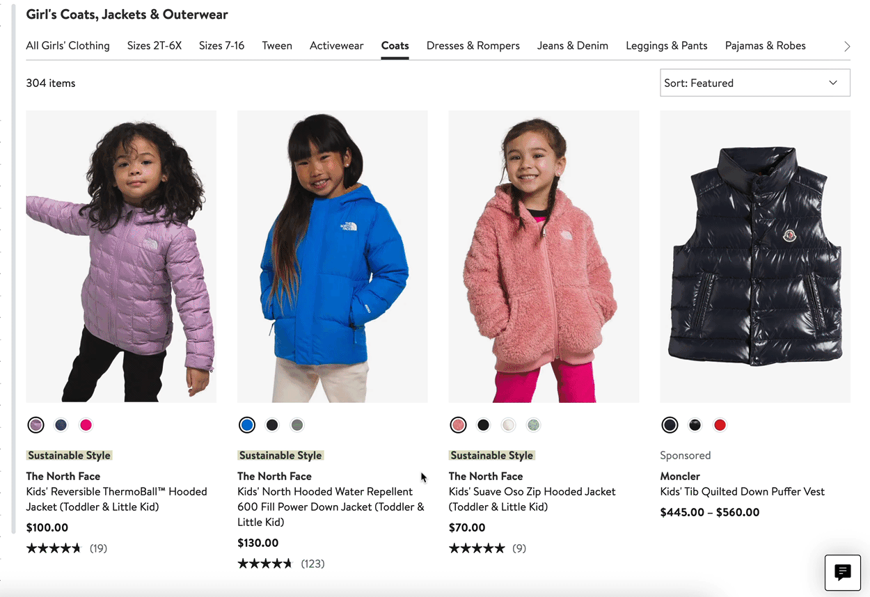
🌿 Nordstrom applies a green highlight to its Sustainable Style badges

👕 Classic Tees highlights gift ideas with a “Most Gifted” flag

🏈 Dick’s Sporting Goods calls out styles with extended sizes and widths — a very helpful attribute!

🍏 Cider color-codes its sale chips for active promotions (red) and final sale (orange)

🏈 Ditto Dick’s Sporting Goods

🏳️ When all flags are a uniform color, it forces shoppers to read each one

👜 Michael Kors selectively applies social proof messaging for top rated items


⛰️ REI annotates select products on sale with “Sale ends in” context, right over the product tile

List view
💻 Dell’s list view clearly separates product specs from other detail

💻 Dell optimizes list view for mobile with a more compact style, adding icon bullets to break the visual monotony

More nice examples from Northern Tool and Crutchfield


👓 Where. Are. The. Specs??!!


Quick view
👠 Nieman Marcus quick view with link to full details in blue so it’s easy to see

Zoom:

👠 Nordstrom’s Quick View modal enables you to navigate through products’ descriptions and variant selectors without leaving the category page

🧘🏽♀️ Alo Yoga lets you choose both your color and size variants through its Quick Add (to Bag) option (not to be confused with Quick View modals)
*This UI pattern is applied to Desktop only

🦈 Gymshark uses a dropdown which provides more space for details like Out of Stock and “Only X Left”

Pagination & load patterns


🥿 Bill Blass doesn’t leave customers guessing


👗 Ann Taylor gives its Back to Top its own lane

💡 Free People gives its Back to Top link its own lane, and a label for extra clarity

More ideas
🐒 Bonobos romances its apparel styles with up to 2 lines of copy

😋 Rave coffee includes taste notes

🔥 Kettle & Fire’s short descriptions are helpful, but may be more useful as simple flavor notes, like Rave above


🎽 Fanatics uses horizontal spacers to clarify which images correspond with which titles and prices


👜 Michael Kors puts visually similar products at your fingertips. Great for catalogs where “collections” apply, or where style attributes drive purchase decisions (Built with Syte.ai)

🍷 TotalWine and More slides similar products inline — this is a great feature to support discovery for customers that like to try it all, or to find lower-priced options. This can pull from non-visual attributes like tasting notes, varietal, region, winery, etc. (Built with Bloomreach)

💡 Lamps Plus’ More Like This chip loads a new page, which may be the best approach where results will exceed 2 rows of product. Context is king!

👓 EyeBuyDirect pulls similar styles, but loads a new page — not the ideal implementation. (Built with Algolia)

💡 Uncommon Goods pulls cross-sells right into a sliding panel (Built with Bloomreach)
🧩 Uncommon Goods provides quick links to “more like this” suggestions directly from the product list detail

🛼 Rollie’s Archive sale is exclusive to registered accounts - you gotta sign in to see sale pricing and add to cart. It leverages CTA buttons in list detail to quick-link to Sign In

💄 Tarte adds “Why Gift This” accordions to its product cards during the holiday summarizing the product description with AI

🫣 Cautions
😑 It’s just soooo much harder to read. Especially in colored type.


Variant-jacking:

Option-jacking:


Back to Category page ideas
👉 Follow on LinkedIn for daily ideas 💡