Tap any tip to open toggle ⚡ some gifs may take a moment to load
Featured ideas 🦄 are rare ideas you may not have seen before ;-)
💡 Ideas and tips
Header menu style and content


Staples saves space including it fully open in the header bar, rather than directly below

e.l.f. pairs its icon with an open box for double-visibility

Anthropologie uses colored type to draw additional attention (but users may miss the search icon within the box)


Several years ago, CXL posted a test case from Diamond Candles (with full test breakdown). A colored hamburger button labeled with MENU outperformed 3 other variants. Today, this merchant has moved on from this pattern, but it’s worth testing on your own site. Below are some top merchants currently using the tactic.


⚡ Page load speed - sticky nav can drag performance when the menu’s HTML and CSS are loaded with each page view. ⚡ Implementation can be tricky — make sure to test this across multiple mobile web browsers!
💍 Pandora’s header menu lets the header menu and promo strip disappear from view as you scroll to certain page depths (and back again)

🛞 Crutchfield collapses its heavy header to a simple bar that remains visible as the user scrolls (this GIF may take a sec to load - static shot below)


🦅 American Eagle’s “Today’s Offers” icon is ambiguous, but the callout adds context. Definitely test this as it can be an equally disruptive as beneficial experience

👜 Chico’s collapses its conventional desktop nav to an app-like menu with large tap targets. Users have quick and clear access to Menu, Stores, Search and Bag

👟 On gets creative with a bold, yellow bar at the bottom of the screen

🚘 Crutchfield invites you to “Get help from an expert like Carlos” to the right of Category links in the desktop header nav, which reflows above the nav menu in mobile

Menu content and CTAs
⛰️ Patagonia slots a CTA for its membership program prominently in its shopping menu, with a colorful icon to draw more attention. If you A/B test this, remember that lower session conversion may be offset by the lifetime value of loyalty members. Remember your objective!

👜 Ganni’s rotating bag icon quick-links to its iconic Bou Bou bags category

👌 Express’ use of shading enables it to slip a promo offer above Category links. This style is visible but doesn’t distract from menu items.

📞 Chewy uses a sticky bottom bar to show its customer support number

📞 Staples includes chat and click-to-call buttons at the bottom of its menu

🔥 Hot Topic provides clear and quick access to commonly used links

📚 Barnes & Noble features different promo cards under different Category sub-menus. Below: Books and eBook categories, respectively


👗 ASOS uses bold colored banners in its menu, notice you can swipe through them as a gallery

👗 Free People features “Matching Two-Piece Sets” — a “category” that customers may be unaware exists…


Ritani lets you Shop by Shape — a key preference when diamond shopping

Vessi sneaks in some cute illustrations highlighting their free shipping and 90 day return value props


/w=1920,quality=90,fit=scale-down)

🦅 American Eagle Outfitters features Offers in its header menu and opens a drawer on-tap (this may take a sec to load - see animation after this static shot)


📿 Puravida does similar

🥾 Columbia uses a similar tactic, but links from its promotional bar
Mobile version:
Desktop version:
🍄 Four Sigmatic embeds attribute chips into its flyout menus for quick pre-filtering of results. It also helps customers understand the key benefits across the product range (GIF loading slow? Jump to the static shot for the gist 👇)


Desktop view:

😎 Ray-Ban pops in a notification icon that reveals a welcome discount offer on-tap/click — a little later than primary content load for extra visibility. This alternative to the entry pop-up is reportedly working well, and appears in both desktop and mobile menus
👖Telfar’s animated menu tiles are cool - but this tactic is rough on web performance. Use wisely (e.g. consider testing a single featured animation, and use .webm video files vs animated GIFs)

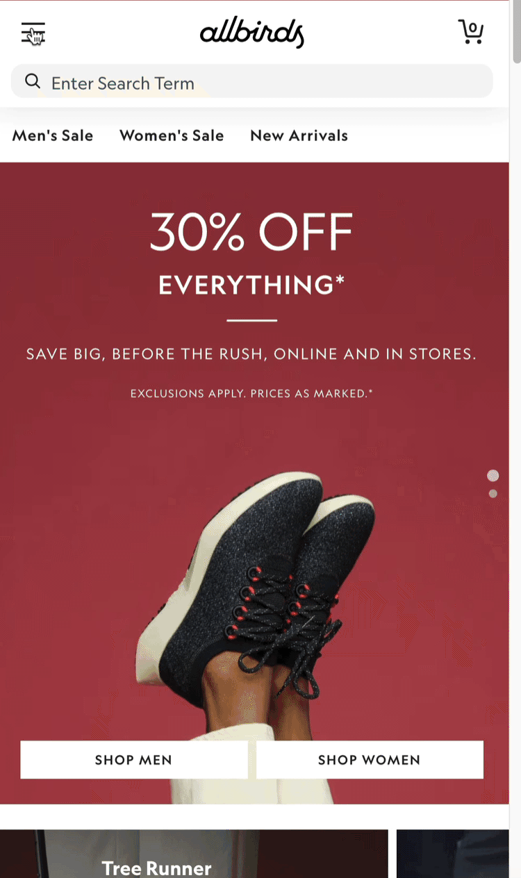
Allbirds nests animations behind sub-menus
Menu list formatting
👌 Orvis’ colored > markers and sub-section fields make it easy to parse shopping links from account features

👌 Thumbnail images can also help differentiate categories from other link types

👌 RiteAid leverages color and icons for featured links, placing Departments below. Depending on your customer habits and use cases, this may be the most user-friendly experience

👌 Ulta’s simple font style differences separate Department categories from themes and special cross-category collections

👀 Puma similarly styles shopping links more boldly than account and service links — but the Login and Register Here buttons are so different, they may be missed due to the “banner blindness” effect outside of the white space

👀 Spacer lines help customers understand like-with-like grouping (although it’s not so intuitive that the Departments link — so far down the list — is the Shop menu

👌 Headers and indented sub-links can also display nicely. All Modern separates departments from “Get Inspired” collection themes

💣 Whatever you do - don’t use uniform styling, like this (mixing Categories with Shop by collections) — aka “menu mash”

💣 More menu mashing


🍱 Ironically, The Container Store has a very un-organized shop menu (it needs both visual hierarchy and alphabetization)


A more performant way to add visual flair (vs. pulling image thumbnails) is to annotate link items with icons or emoji. You can selectively apply them to non-shoppable sections like Account, Store Locator, Order Tracking and Customer Service, or style your Shop menu.
🎨 Color grabs more attention ;)


🫣 Cautions
🛍️ Shopping Cart/Bag icons are conventionally found on the far-right of the menu on desktop and mobile — Toys R Us gets it backwards

🍔 Similarly, placing your hamburger menu on the far right is risky — especially when it’s lumped with all other icon link
💎 Creative icons can be cute — but customers won’t click what they don’t understand. Ritani’s diamond (rewards) and ribbon (saved items) are not easily recognizable off the bat

Lush’s cute smiley face indicates the Account link — but it’s not clear
🍏 Cider’s globe and headphone icons are so creative — they’re confusing (not to mention, the missing hamburger 🍔

👓 White-on-image icons and text is trending hard, especially in DTC — but it makes it PAINFUL for users — especially those with visual impairments


👓 ALLCAPS IS JUST HARDER TO SCAN AND READ. PERIOD.

👓 Underlined style is harder to read. Period.

🙈 You want your search icon/box front-and-center, not hidden behind the hamburger!

Can you spot these tabs, or would you have missed them?


🙈 Target’s category tiles with centered labels make it hard to scan, granted this hides more categories behind the > marker

💄 Sephora’s mobile website pushes its hamburger menu to the bottom of the screen. New users can be confused by this unconventional pattern, it’s not intuitive to look for the Shop menu here

Back to Home page & nav ideas
👉 Follow on LinkedIn for daily ideas 💡