Ecom Ideas
  • Homepages & nav
  • Category pages
  • Product pages
  • Cart pages
  • Checkout
  • Site search
  • Internationalization
  • Holiday ideas
  • Featured idea gallery
  • Topical articles
Subscribe

Get daily ideas

LinkedIn
💡
Ecom Ideas
/Product pages
Product pages
/
👆
Variant selection
👆

Variant selection

Tap any tip to open toggle ⚡ some gifs may take a moment to load

Featured ideas 🦄 are rare ideas you may not have seen before ;-)

💡 Ideas and tips

Design patterns

‣
Kill 🔪 dropdown menus
💡
Really, they’re the worst. Here’s why:

👉 Dropdowns hide the full range of variant options, meaning you’re forcing users to click or tap to see whatcha got.

👉 For products with variant combos (like color and size), you want to see which combos are currently in-stock without having to work with multiple dropdowns.

👉 Dropdown menus can look awful on mobile devices, especially for loooong lists that require scrolling.

👉 The biggest risk is users mistakenly overlook that they have options at all and assume the default — especially if your juicy add-to-cart button outshines the menus.

On the flipside, dropdowns do keep the UI tight in the ever-so-critical Add to Cart section. They’re not as terrible when applied to single option products, where one dropdown holds all the variants. In such case, make sure to include stock availability in the list (bonus points for color or image swatches) — see examples below 👇

😬 Hiding the variants behind dropdowns means most will not see their other options. This can also hurt inventory turnover for the hidden SKUs!

image

👀 How many visitors will intuit that there’s more washes available?

image

👎 On mobile, a full-width dropdown can easily compete with Cart buttons — especially a pancake stack like this one…

image
‣
Use large, uber-tappable variant chips

🏀 Nike dunks on dropdowns with large, tappable targets (but the horizontal scroller for Colorway will throw some users off)

image
‣
🦄 Try a sliding drawer instead of dropdown for long lists of variants

🗄️ Nordstrom keeps a core set of clickable swatches with a View More link that opens a panel drawer. The downside is many users will miss or ignore the View All. You can experiment with different ways to style “View all” link

image
‣
Try modals for variant quantity selection / bundle configurators

😋 Woops Macarons opens a modal to show available flavors for choose-your-own-flavor boxes. This enables users to choose multiples of any flavor, and see flavors in context

image
‣
🦄 Use grid-to-list toggles to display additional detail
💡
There are use cases where color swatches alone hide relevant details customers are looking for, such as specific shade names or stock availability at-a-glance A list view presents more detail for customers that want/need it, while keeping the default pattern clean

💄 Sephora shows compact Grid view by default, but enables List view to make it easy to scan and locate specific shade names without clicking multiple color swatches. This also leaves room for short descriptions and low inventory flags

image
‣
🦄 Men-to-Women size-and-color toggle

👟 Vessi’s toggles convert Men’s and Women’s Sizes and Colors instantly

image
‣
🦄 Try scoped variant filters (where appropriate)

💋 Kylie Cosmetics lets users scope by color family. This is incredibly helpful when you display a large number of variants or where common attributes warrant grouping — flavors, scents, finishes, etc

image

👙 Andie Swimwear applies this tactic to its fabrics

image

🍌 Blendjet tabs New, Solids, Patterns, Metallics, Special Editions, Sale and Show All

image

👙 Stripe & Stare tabs Color, Contrast, Print and Sale

image
‣
🦄 Try variant-level color blending

🩱 Skims updates its theme accent colors as you select color variants. This type of animation can slow down site performance so make sure to A/B test it if you try

image

🍳 Caraway takes a similar approach as you explore its color variants in an infographic block on PDPs

image

🦍 YETI does it too…

image

🍭 Another color pop from Olipop

image

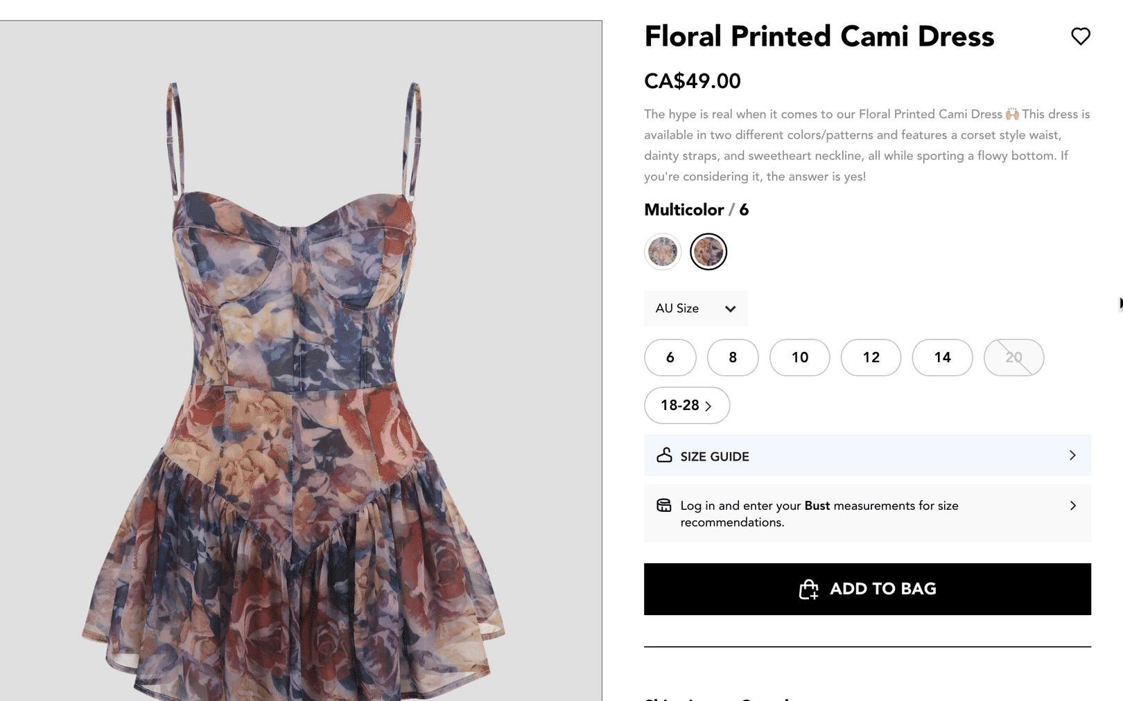
Displaying out-of-stock variants

‣
🦄 Optimize your “strikeout” color for light and dark swatches

🦌 Abercrombie applies darker strikeout over lighter swatches — spot it on the 2nd and 3rd swatches above

image
‣
Use both gray-out and strike-out for out-of-stock variants

👕 J.Crew applies dark shading over variants that are out of stock to ensure the white strikeout effect is visible even on light color swatches

image

💡Anthropologie makes tap targets large, clickable and clearly fades AND strikes out out of stock variant chips, making it very easy to understand what’s currently selected, what’s available and what’s out of stock

image

💡ASOS applies both a gray-out and strike-out effect over it’s lifestyle image “swatches,” as strikeout alone may not be visible over all photos

image

😬 Contrast the above examples with this merchant — when most variants are out of stock, it’s hard to see what’s available!

image

😬 Strikeouts can completely blend with swatches if you’re not careful!

image
‣
Show “only X left” on low-stock variants

🥿 M.Gemi displays “only X left” when you hover or click over each variant

image

👕 Land’s End provides instant feedback for variants that are low stock when selected

image

👗 Lulus uses a bold badge when you select a low-stock variant

image
‣
Provide a “Waitlist” stock notifier

👗 Lulus provides an estimated arrival for restocks when presenting the stock notifier modal

image

👗 Princess Polly adds an email icon for a visual cue to “email me when back in stock,” along with an open notifier input field

image

👗 Fashion Nova includes a bell icon on out-of-stock variant chips to hint clicking will open a stock notifier feature

image
‣
Make sure your default “landing” variant has a fallback rule
💡
Many ecommerce sites select a default variant (such as the smallest size) which can glitch when that variant is out-of-stock — visitors may assume the whole product is unavailable, especially if you disable your Cart button concurrently. If you must use the pre-selected variant method, ensure you’ve coded your shop to select the next available variant as the default.

💡 If your default variant is out of stock, make sure the next-in-line variant is pre-selected when users land on the PDP

image
‣
Provide a live help CTA to find alternative products

👗 Aritzia suggests calling the Concierge number to find something similar. While I doubt too many online shoppers take up the telephone option, a live chat CTA may help save some sales

image
‣
🦄 Include estimated restock date

👗 Lulus lets you know when they anticipate an item’s restock date, helping to set clearer expectations

image
‣
🦄 Use visual search to suggest similar products

🧘🏾 Alo includes a “See similar items” link with its stock notifier widget that jumps to the Similar Items carousel

image

👑 Princess Polly embeds visually similar products inside its notifier widget Vendor: Nosto

(Only products with the selected color/size variant in stock will display in the widget)

image
‣
🦄 Show a “more like this” drawer

👢 Boots proactively slides a “more like this” drawer when you land on an out-of-stock PDP.

image

Error feedback

‣
Use “Select [variant]” as default button copy

🐊 Crocs disables its Cart button until variant selections are made, with “Please select a size” copy

image

🥿 Toms is a bit more formally polite, and adds “Please” ;-)

image

👖 Nudie Jeans has a nice multi-step selection experience for waist/length size combos - the challenge is variant chips are hidden and it’s hard to see stock availability without a click

image
‣
🦄 Change button copy to “Please select [variant]” on hover or tap

🥿 M. Gemi changes button copy if you attempt to add to cart without selecting variants. The context changes depending on what option is missing (color, size, etc)

image
‣
🦄 Open your variant selector from the Cart button
💡
If a shopper tries to add-to-cart without selecting their variant, you can trigger a selector menu reinforce the requirement. Keep in mind this is trickier to do for multi-variant products.

👗 American Eagle Outfitters auto-expands its Size dropdown to make it super obvious what the buyer needs to do

image

👖 Desigual’s pattern looks even smoother, keeping the selector above the cart button

image

👗 Ashley Stewart shows exposes a size selector if you try to add to cart without choosing your size

image
‣
🦄 Try a Cart button nudge

🩳 Chubbies uses Select Size as its button text wiggles its button if you neglect to select one before clicking

image
‣
Show an error messages with both the Cart button and the Variant group
💡
Don’t rely on shoppers to scroll up to find their error - spell it out Close to the cart button, and place a second error message close to the variant group that requires action:

👍 Anthropologie serves a callout near the Basket button and red-lines the section where action is required. Remember, mobile users may not see the variant section until they scroll back up, and may lose context of the Cart button as they do

image

😶 Make sure your error message is not out of context with the Size section

image

😶 Error messages placed with the Cart button may drift out of eyesight as the user scrolls up to find the Size section

image

👎 Land’s End doesn’t display an error message close to the Cart button, users may fail to see it

image
‣
If >1 variant needs selection, display them as bullets

🩳 LL Bean bullets out the variants that need selecting if you tap its disabled Add to Bag button, and shows red-line error messages with each missing Option. The bullets make it easier to see that 2 variants are missing than if explained in a single block of text

image
‣
Red-box your entire section, instead of individual variants
💡
Many sites red-box each variant chip which can confuse shoppers, especially when out-of-stock variants are treated the same as in-stock. Boxing the whole block of variants may provide more visual clarity. Compare the two design patterns below:

👗 Fashion Nova boxes the entire block of variants

image

🩳 Land’s End red-boxes each individual variant chip (above), including out-of-stock variants (below)

image

🩳 Note the difference in error feedback as well — it appears Land’s End has redesigned and dropped its red button callout for a simpler red text above the button (perhaps to accommodate its PayPal Buy Now option)

image

Combined listings (Shopify)

‣
🦄 Show bundle variants

🍯 Honeylove uses Shopify’s Combined Listings app to surface individual and bundled SKUs together in a single PDP Buy Box (URLs change as you flip through the variants)

image

More ideas - adding context

‣
🦄 Use microcopy to add context to variant options

✈️ Solgaard adds context to it’s luggage size variant list by noting how many outfits for X number of trip days it fits and an illustration of each carry-on height

image

😴 Nectar Sleep adds “best for” badges to each variant option in its bundle builder — super smart given that clicking out of the bundle flow to compare products is a tedious conversion killer

image

🛋️ Rove Concepts shows mini-descriptions for each color variant because their associated fabrics have different properties to describe and romance

image

🍵 David’s tea translates weight variants into how many cups of tea you can expect from it. (Each variant shows its own details as you tap through)

image

🎒 Tortuga adds useful context for travellers to understand the difference between Liter sizes

image

💡Consider adding both Letter and Numeric values on Size variant chips

image
‣
🦄 Use pop-out mini-descriptions to add context to variant options

😀 Bonobos exposes a quick description to help users understand their Fit logic. The scroll wheel is a bit disruptive, but a cool idea to test. Watch your page load speed and cart to detail rates when A/B testing this

image

💡Ruggable uses tooltips to explain the differences between its rug piles and pads AND adds illustrations to the selection chips. Double win. See examples below

image
image
image
‣
🦄 Dynamically convert to international sizes

🍏 Cider supports international size conversion that swaps out the variant options on user selection. This is an advanced move that requires custom development and data mapping

image

🥿 Adieu lets you flip through shoe size variants for US, UK, EU and cm measurement

image

😃 Hooray for the metric system! Amika helps international visitors translate ounces into milliliters

image
‣
Add flags to highlight specific variants

🔫 Bulletproof Coffee adds “New” and “Best Seller” flags to specific variants. Use these to highlight Staff Picks, Limited Edition, Most Wished For or “Best For” callouts

image
‣
Add image thumbnails for options that need context

🛠️ Build.com illustrates its Style options for additional clarity

image
‣
Consider adding star ratings to variant chips

💋 Kylie Cosmetics includes variant-level star reviews in variant chips. While this is technically a pre-set product bundle, this design pattern could be tested for individual variant selection on a PDP or within a bundle configurator to help customers make quicker decisions

image

This inspired me to mock up what inline ratings could look like on Kylie’s site:

image
‣
🦄 Add size chart detail to size selection buttons

🩱 Shapermint fits size info below each variant as you click through. Beautiful!

image

👕 Bombas includes chest measurements on Size variant chips for quick reference

image
‣
Add price upcharge detail on selection buttons (where relevant)

💡 IKEA includes pricing upcharges and downcharges per variant, where applicable

image
‣
🦄 Provide fit-finding advice, where applicable

👟 Foot Locker shows a “Tip” for selecting your size for styles that may fit larger or snugger than the norm

image

👗 Loelife embeds an expandable widget with a fit graph for each size variant (based on review feedback)

image
‣
🦄 Try a BOGO offer on another variant option

🍯 Honeylove prompts you to add another color to get 20% off your second-of-the-same. Your size variant is already selected for convenience ;)

image
‣
Try “Shop more in this [variant]” links

👗 Azazie lets you filter the entire product catalog to a specific attribute (in this case, Color) with a single click

image

🫣 Cautions

‣
Don’t apply invisible strikeouts for OOS variants

🤨 Can you tell which Size variants are out of stock?

image

👻 Be careful with strikeouts, they can blend in with color swatches. Adding a black, buffered border around the color swatch gives room for a black strikeout to be visible, regardless of the swatch color behind it

image
‣
Hon’t hide variants behind a horizontal slider

💣 Target misses the mark with this design pattern, there are a number of sizes hidden behind this unconventional design pattern

image

😐 Lululemon also hides additional colors and sizes behind a horizontal scroller

image
‣
Avoid using lifestyle images as color swatches

🤷‍♀️ Does this one need explaining?

image
‣
Don’t style variant selectors like a CTA button

😞 The variant picker competes with bold CTA buttons. It’s so subtle, it’s easy to miss the accordion marker indicating additional options

image

🙈 Olaplex hides larger, value size options behind a dropdown. This communicates Information (confirming bottle size), not Options

image
‣
Avoid using a dropdown for large option list without context or organization

😵 Meijer’s messy menu uses ALLCAPS, fails to alphabetize options and lacks context on the differences between colors, forcing users to make a selection, exit the dropdown, check the image gallery, and re-use the dropdown to preview pattern/colors

image
‣
Don’t obscure the dropdown marker

🤨 The “Type” Option dropdown looks nothing like a variant selector and is outshined by the “100% natural and organic ingredients” chip

image

🧨 IKEA’s “Choose size” appears to have only one option. Its unconventional dropdown marker is placed so far to the right, it’s highly unintuitive to recognize as a menu control

image

🍳 Hidden behind the size variant drawer are 3 options with different prices. Given that circumference is an important attribute to frying pans (the product in question), it’s a huge miss

image
‣
Don’t write your error message like a robot

💣 This overly-technical error message is overkill. Choose one of the “good idea” patterns instead!

image

Back to Product page ideas

👉 Follow on LinkedIn for daily ideas 💡